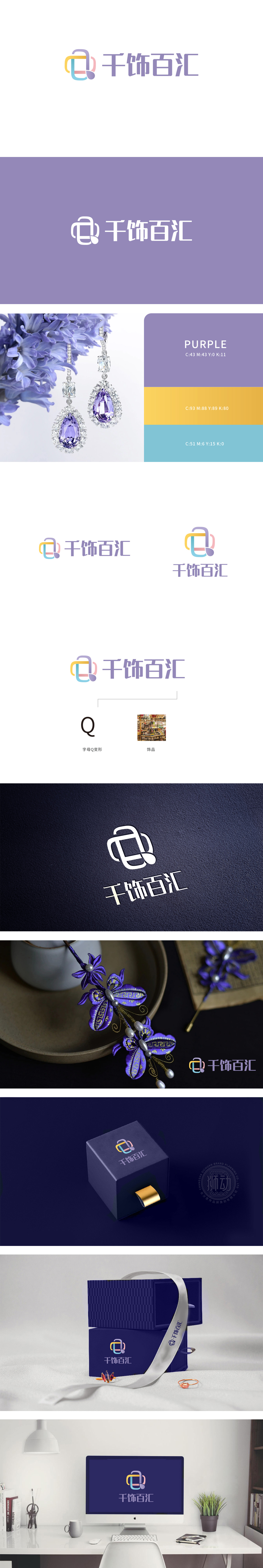
狮动设计采用整体是「Q(千的首字母)」与「S(饰的首字母)」的变形——黄、蓝、粉线条组成类似「Q」的环状结构,连接的紫色「小水滴」则像「S」的尾部,用品牌名称的首字母做视觉锚点,强化记忆。紫色「小水滴」是关键细节,像饰品上的宝石吊坠或珍珠,直接关联「饰品」的核心属性;环状结构则象征「汇聚」,暗示品牌是「各类饰品的集合地」,用「极简符号+强关联细节+和谐配色」,精准传递了饰品店的「时尚+包容」核心信息,把「品牌含义」「行业属性」「审美需求」用视觉语言完美融合了 。
Lion design as a whole is a variation of "Q (initials of a thousand)" and "S (initials of ornaments)"-yellow, blue and pink lines form a ring structure similar to "Q", and the connected purple "water droplets" are like the tail of "S", and the initials of the brand name are used as visual anchors to enhance memory. Purple "water droplets" are key details, such as gem pendants or pearls on ornaments, which are directly related to the core attributes of "ornaments"; The circular structure symbolizes "convergence", implying that the brand is "the gathering place of all kinds of ornaments".


扫码或拨打添加客服微信


