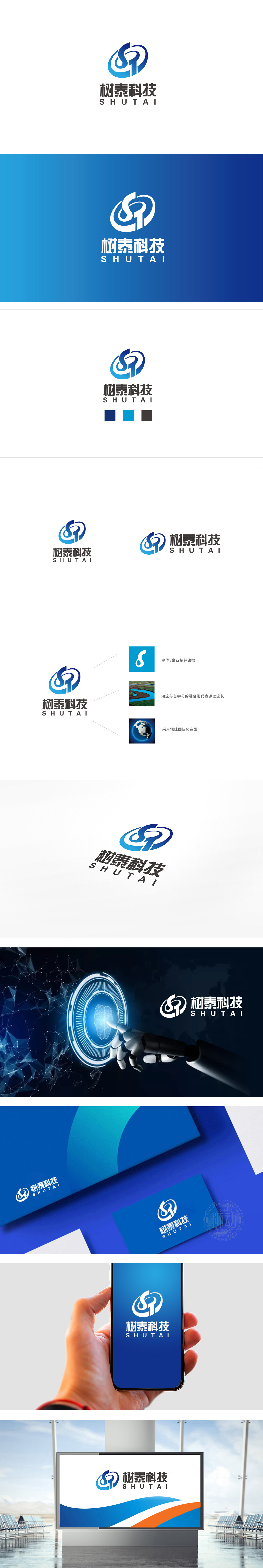
狮动设计采用字母「ST」的艺术化变形:流畅的曲线像电子回路,又像数据流动的轨迹,环绕的结构自带「连接性」;蓝白渐变的色彩过渡,像科技产品的金属质感,又像数字界面的光影效果,瞬间把「冰冷的科技」变成了「有温度的动态感」。用「简洁+专业」强化科技形象。这种设计自带「现代、理性、高效」的属性,完美贴合科技公司「专注、专业」的定位。整体既通过「ST」的变形保留了品牌的「独特性」,又用「回路」「数据」的隐喻传递了「科技企业」的核心价值。
Lion design adopts the artistic deformation of the letter "ST": the smooth curve is like an electronic circuit and the trajectory of data flow, and the surrounding structure has its own "connectivity"; The gradual color transition of blue and white, like the metallic texture of technology products and the light and shadow effect of digital interface, instantly turns "cold technology" into "dynamic feeling with temperature". Strengthening the image of science and technology with "simplicity+professionalism" This design has the attributes of "modernity, rationality and efficiency".


扫码或拨打添加客服微信


