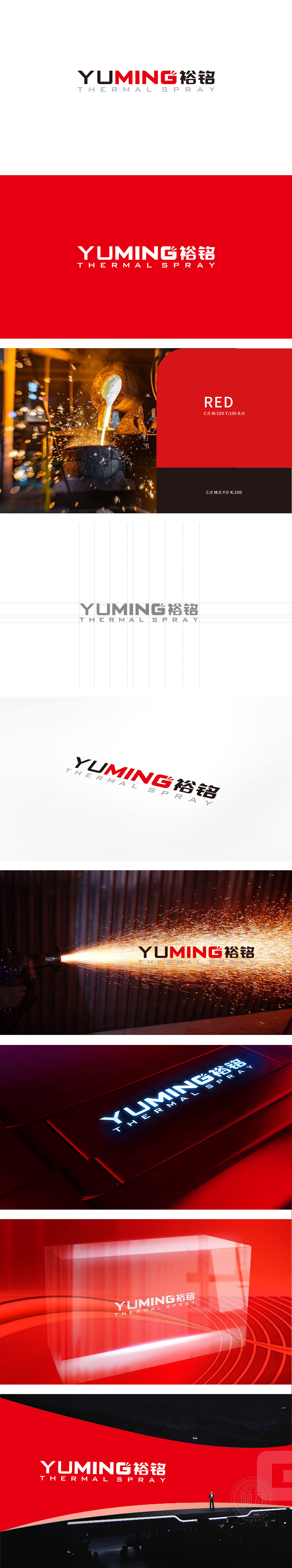
狮动设计将字母“Y”“M”“G”采用棱角分明的黑体结构,线条硬朗、笔画厚重,既传递出工业制造领域的“力量感”和“稳定性”,又与喷涂工艺中“金属质感”“坚固涂层”的特性形成联想。字母“G”末端的红色“喷溅状”设计是点睛之笔:红色不仅增强视觉冲击力,其锐利的尖角和动态线条直接模拟了热喷涂过程中材料高速喷射的瞬间形态,将抽象的“喷涂”动作具象化,让行业属性一目了然。“裕”(寓意丰裕、充足)与“铭”(寓意铭记、品质)的字义组合,传递出品牌对“工艺卓越”和“客户信赖”的追求。通过“G”字母末端的红色喷溅这一“微设计”,将“热喷涂”这一专业技术的核心动作可视化,同时整体保持了工业品牌所需的稳重与专业。
Lion design uses the letters "Y", "M" and "G" with angular and bold structure, with tough lines and heavy strokes, which not only conveys the sense of strength and stability in the industrial manufacturing field, but also associates with the characteristics of "metallic texture" and "solid coating" in the spraying process. The red "splash-like" design at the end of the letter "G" is the crowning touch: red not only enhances the visual impact, but also directly simulates the instantaneous shape of high-speed spraying of materials in the process of thermal spraying with its sharp sharp corners and dynamic lines, which visualizes the abstract "spraying" action and makes the industry attributes clear at a glance.


扫码或拨打添加客服微信


