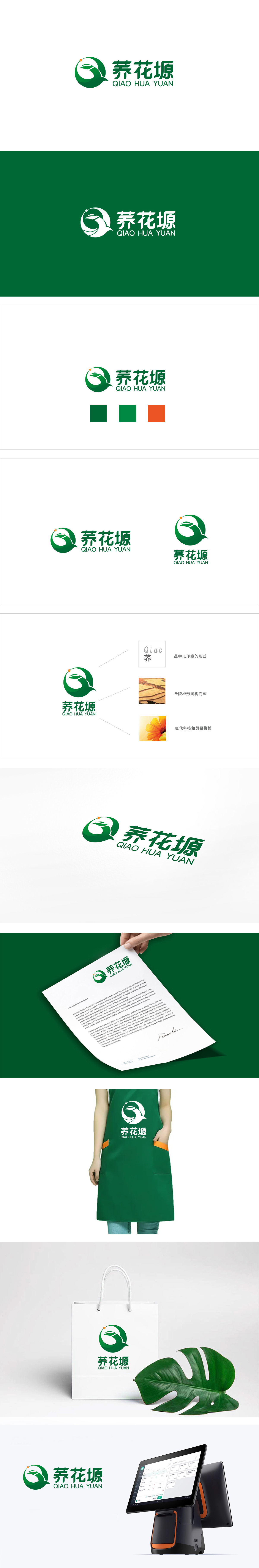
狮动设计通过圆形图案,藏着叶子(代表农作物)、曲线(像生长的藤蔓/流动的水),还有一个橙色小点(像成熟的果实/阳光):叶子:明确指向“农产品”,让观众一眼就懂品牌做的是“地里长出来的东西”;曲线:增加了动态感,暗示“生长、活力”,橙色点:像画龙点睛的“亮点”,既打破绿色的单调,又隐喻“收获”“新鲜”,让logo更有温度。Logo把农产品的“本质”(天然、质朴)和“品牌需求”(识别性、记忆点)完美融合,用质朴传递“可靠感”。
Lion design adopts a circular pattern, which hides leaves (representing crops), curves (like growing vines/flowing water) and an orange dot (like ripe fruits/sunshine):Leaves: clearly point to "agricultural products", so that the audience can understand at a glance that the brand is doing "things that grow in the ground"; Curve: it adds a sense of dynamic, implying "growth and vitality", and orange dot: like a "bright spot" that makes the finishing point, it not only breaks the monotony of green, but also symbolizes "harvest" and "freshness", making the logo more warm. Logo perfectly integrates the "nature" (naturalness and simplicity) and "brand demand" (identifiability and memory) of agricultural products, and conveys the "sense of reliability" with simplicity.


扫码或拨打添加客服微信


