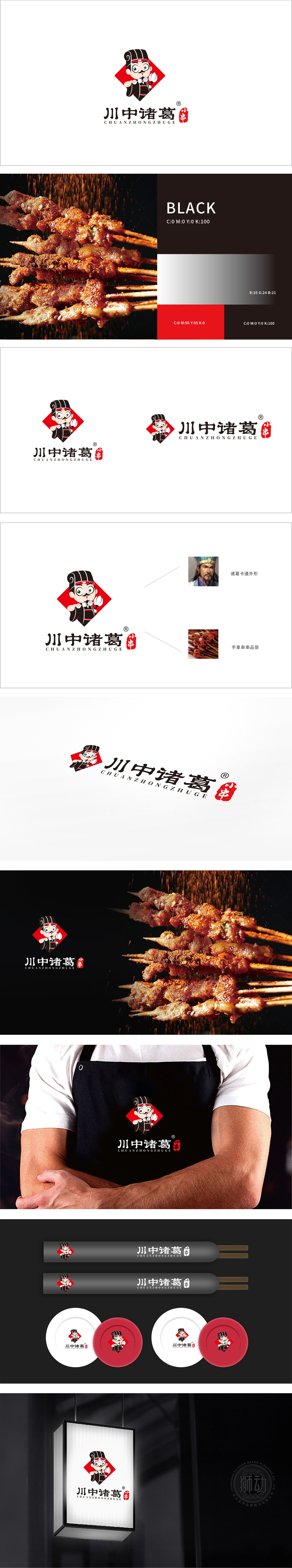
狮动设计以文化IP的趣味化再造,人物形象——诸葛IP的年轻化转译,,主体为卡通化的“诸葛亮”形象,保留了标志性的纶巾 和长袍,通过高髻、长须等细节强化历史人物辨识度,精准关联“诸葛”品牌名。人物手持串串 和羽扇,既点明“小串”产品属性,又用“羽扇”暗合诸葛亮“智慧”标签,隐喻品牌对口味或食材的“精心谋划”。红色:代表热情、辣味、中国传统喜庆感,直接关联川渝饮食文化中的“麻辣”属性,同时刺激味觉联想,通过萌化改造、道具关联等手法,让传统元素与现代商业需求(年轻化、品类清晰、传播性)形成深度绑定。
Lion design recreates the interest of cultural IP, and the image of characters —— Younger translation of Zhuge IP The main body is the cartoon image of "Zhuge Liang", which retains the iconic black silk scarf and robe, strengthens the recognition of historical figures through details such as high bun and long beard, and accurately associates the brand name of "Zhuge".The characters hold strings and feather fans, which not only point out the product attributes of "small strings", but also use "feather fans" to coincide with Zhuge Liang's "wisdom" label, implying the brand's "careful planning" of taste or ingredients. Red: It represents enthusiasm, spicy taste and traditional festive feeling in China.


扫码或拨打添加客服微信


