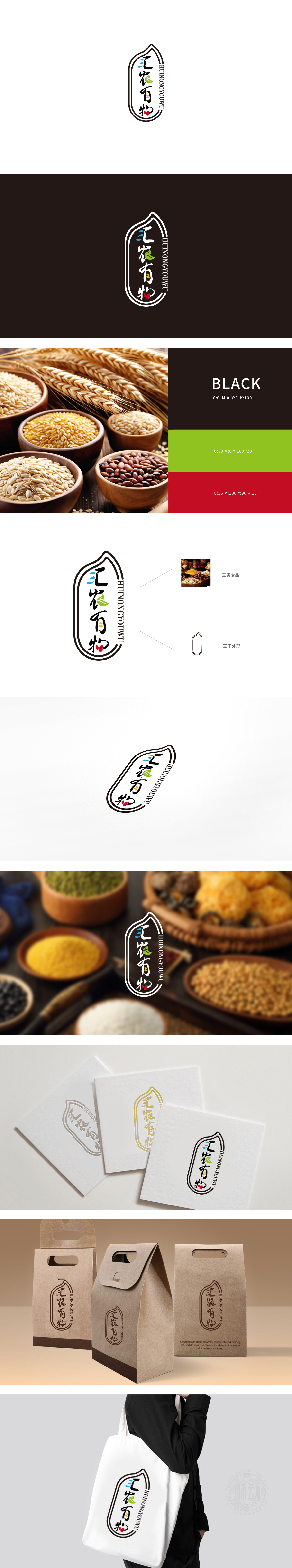
狮动设计采用不规则的“叶片/豆荚”轮廓,线条圆润柔和,既像一片饱满的植物叶片,又暗含豆类作物的荚果形态,整体轮廓传递出“源于自然、天然生长”的产品定位,“汇农有物”手写书法字:字体笔触自然流畅,“汇”字三点水用蓝、绿、黄三色圆点替代,既保留了汉字结构,又通过色彩区分象征“水、叶、谷物”的自然元素;“农”字下方的“辰”部融入绿色叶片,直接点明“农业、植物”属性;“物”字右侧的点画用两颗红色果实(或豆粒)替代,与豆类五谷的“颗粒感”呼应,细节处暗藏产品品类线索。小面积彩色(三色圆点、叶片、果实)在黑色背景上形成视觉焦点,通过色彩符号快速唤醒“自然、健康、原生态”的联想,LOGO整体风格偏向“传统与现代结合”,既有手写书法和印章式轮廓的文化底蕴,又通过符号化的图形(叶片、果实、颗粒)传递清晰的行业属性。能够直观建立“农产品、原产地、天然食材”的品牌认知。
Lion design adopts an irregular "leaf/pod" outline with round and soft lines, which is like a full plant leaf and implies the pod shape of bean crops. The overall outline conveys the product positioning of "from nature and natural growth". The handwritten calligraphy of "Huinong Youwu" is natural and smooth, and the three dots of "Hui" are replaced by blue, green and Huang San dots, which not only retains Chinese characters. The "Chen" part under the word "agriculture" is blended with green leaves to directly point out the attributes of "agriculture and plants"; The stippling on the right side of the word "thing" is replaced by two red fruits (or beans), which echoes the "graininess" of beans and grains, and the product category clues are hidden in the details. Small-area colors (three-color dots, leaves and fruits) form a visual focus on a black background, and quickly awaken the association of "nature, health and original ecology" through color symbols.


扫码或拨打添加客服微信


