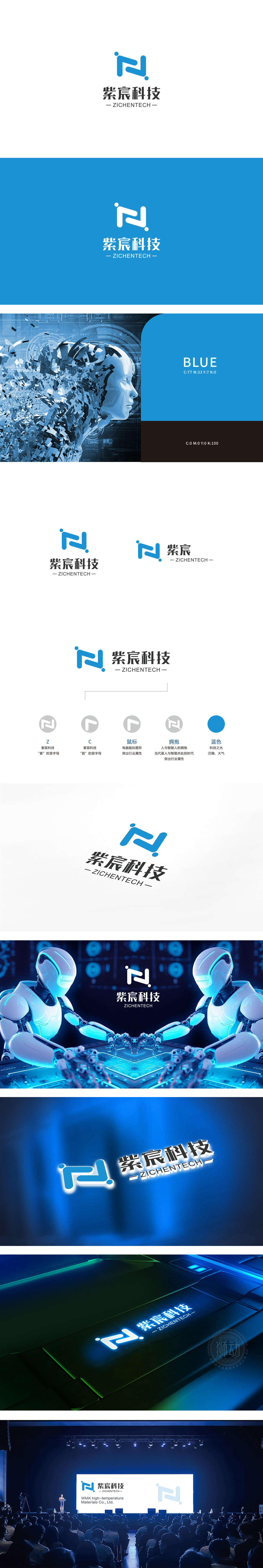
狮动设计采用流动与连接的“N”型动态感,主体由两个对称的蓝色弧形线条构成类似“N”的抽象符号,线条圆润流畅,传递出包容、协作、灵活的视觉感受。上下两点(圆点)如同连接的节点,强化了“沟通、网络、纽带”的意象,暗示企业注重内外部连接,蓝色作为科技行业的经典配色,象征专业、理性、可靠,符合科技企业的品牌调性;明度和饱和度适中,平衡了“技术感”与“亲和力”。整体标志通过蓝色理性+简约高效”—— 以数据驱动人力资源决策,打造多元包容的职场文化。
Lion design adopts the "N" dynamic sense of flow and connection, and the main body is composed of two symmetrical blue arc lines which form an abstract symbol similar to "N". The lines are round and smooth, conveying an inclusive, cooperative and flexible visual experience. The upper and lower dots (dots) are like connected nodes, which strengthen the image of "communication, network and bond", suggesting that enterprises pay attention to internal and external connections, and blue, as a classic color scheme in the technology industry.


扫码或拨打添加客服微信


