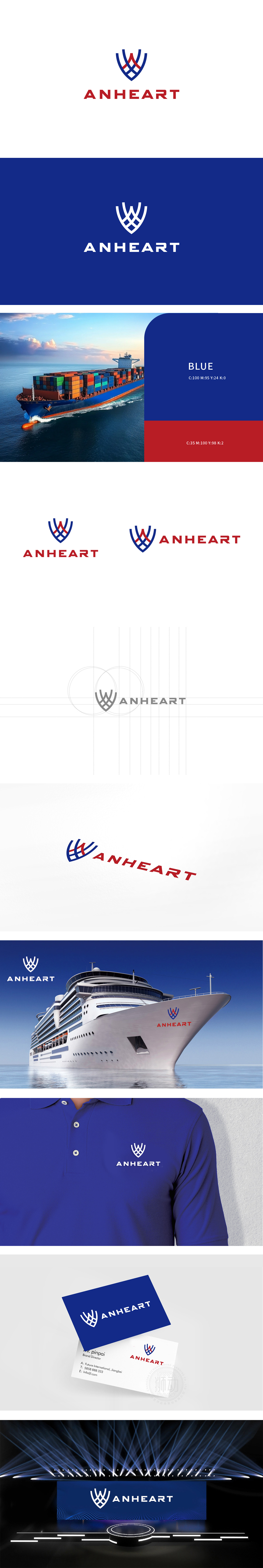
狮动设计采用盾形轮廓与动态线条的结合,以蓝红两色交织的曲线构成盾形外框,蓝色线条硬朗且呈对称放射状,类似船舶的“桅杆”或“船帆”的抽象形态,传递出航海领域的稳定与开拓感;红色线条则以更锐利的折线穿插其中,暗示陆地交通的速度与动力。两者交织于盾形中心,既像车船领域常见的“防护盾”符号(象征安全、可靠),又通过线条的穿插感体现“水陆协同”的行业属性。整体通过对“线条语言”“色彩心理学”和“行业符号学”的精准运用,成功将“车船交通”这一细分领域的属性融入视觉符号,既展现了品牌的专业定位,也传递出“技术驱动、水陆并举”的发展愿景。
Lion Design adopts the combination of shield-shaped outline and dynamic lines, and the blue-red interwoven curves form a shield-shaped outer frame. The blue lines are tough and symmetrical and radial, similar to the abstract form of a ship's "mast" or "sail", conveying the sense of stability and development in the navigation field; Red lines are interspersed with sharper broken lines, suggesting the speed and power of land traffic. The two are intertwined in the center of the shield, which is not only like the common symbol of "protective shield" in the field of vehicles and ships (symbolizing safety and reliability).


扫码或拨打添加客服微信


