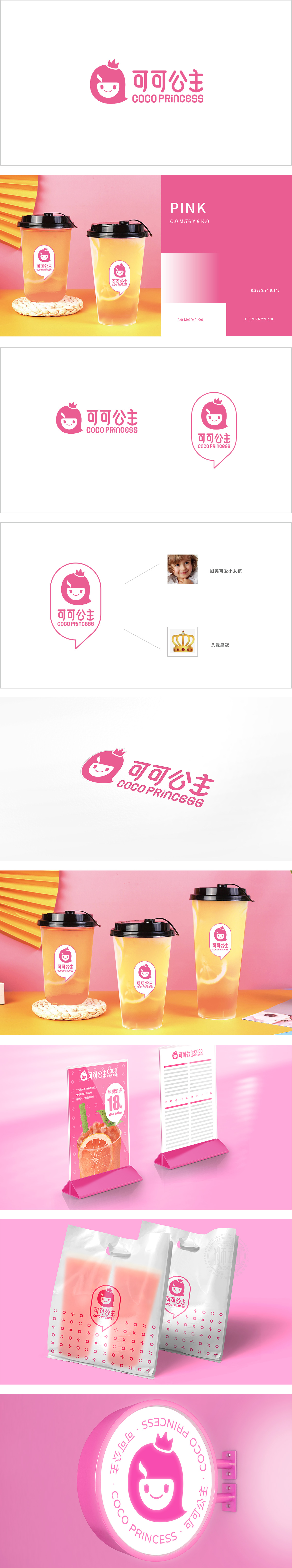
狮动设计采用卡通化的公主头像为核心:粉色卷发、头顶皇冠、脸颊红晕,搭配微笑表情,直观传递“甜美、可爱、梦幻”的气质,精准契合奶茶的核心消费群体——年轻女性、学生党对“颜值”“情感共鸣”的需求。头像中隐藏的“火焰/热气”符号,既暗示奶茶的“热饮”属性,,又传递品牌的活力与温暖感。粉色是公认的“少女色”“甜蜜色”,与奶茶的“甜”“治愈”属性高度绑定,能快速唤醒消费者的愉悦感;整体造型“软萌”不生硬,与奶茶的“软糯口感”形成通感联想。
Lion design takes the cartoon princess head as the core: pink curly hair, crown on the top of the head and flushed cheeks, with smiling expression, which intuitively conveys the temperament of "sweet, lovely and dreamy" and accurately meets the needs of young women and student party, the core consumer groups of milk tea, for "face value" and "emotional resonance". The "flame/hot air" symbol hidden in the head portrait not only implies the "hot drink" attribute of milk tea, but also conveys the vitality and warmth of the brand. Pink is recognized as "girlish color" and "sweet color".


扫码或拨打添加客服微信


