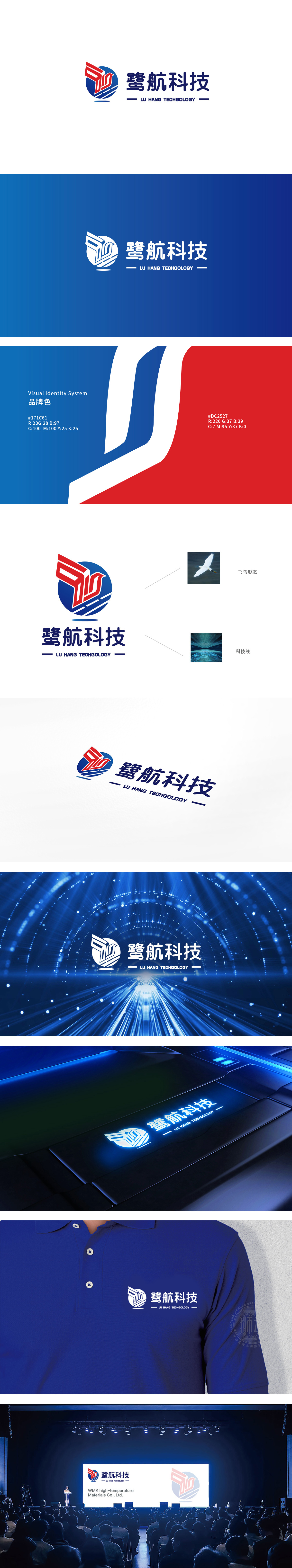
狮动设计以蓝色圆形为基底,嵌入红色“鹭鸟”意象,通过几何化线条重构翅膀的动态处理:红色线条以锐角折线呈现,向上扬起的姿态既模拟了鹭鸟展翅的形态,又暗藏“箭头”的速度感,巧妙将“鹭”的地域文化符号与“航”的科技动感结合。蓝色圆形边缘添加了两条白色弧线,既像是声波、信号的扩散(契合科技行业的“连接”属性),又通过线条的粗细变化增强了圆形的立体感,使整体图形在静态中透出动态韵律,该LOGO通过抽象化图形、精准色彩与文化隐喻的结合,成功塑造了兼具地域特色与科技感的品牌视觉形象。
Lion design is based on the blue circle, embedded with the red image of "heron bird", and the dynamic treatment of wings is reconstructed through geometric lines: the red lines are presented in acute broken lines, and the posture of raising upwards not only simulates the shape of heron bird spreading its wings, but also hides the sense of speed of "arrow", and skillfully combines the regional cultural symbols of "heron" with the dynamic technology of "navigation". Two white arcs are added to the edge of the blue circle, which is not only like the diffusion of sound waves and signals (in line with the "connection" attribute of the science and technology industry).


扫码或拨打添加客服微信


