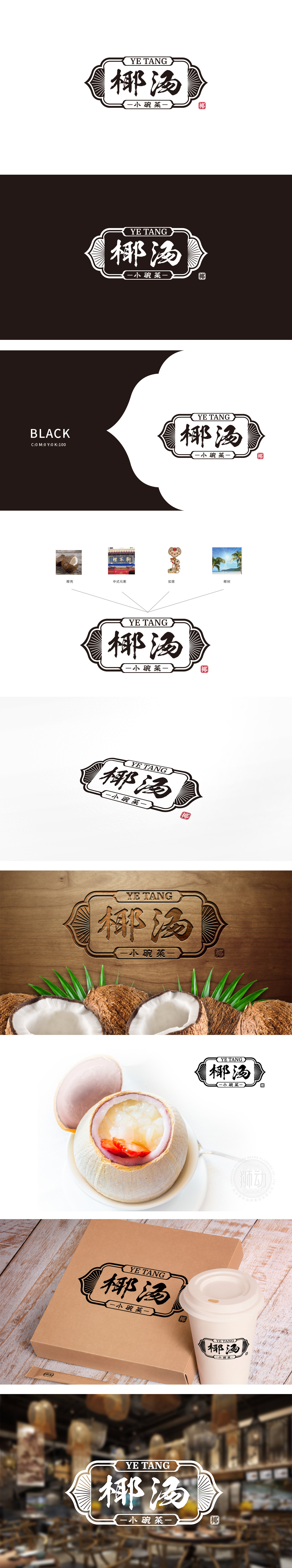
狮动设计采用盾形边框+卷草纹装饰的组合,边框线条刚柔并济,盾形轮廓,传递稳固感与品质承诺;内层以对称的放射状线条,暗合“汤品”的温热、滋养属性。“椰汤”采用毛笔书法字体,笔触洒脱有力,兼具手写温度与品牌个性,整体用视觉语言讲述“传统味道·现代便捷”的品牌故事,传递“东方饮食文化”的气质。
Lion design adopts the combination of shield-shaped frame and grass scroll decoration, with rigid and flexible frame lines and shield-shaped outline, conveying a sense of stability and quality commitment; The inner layer with symmetrical radial lines coincides with the warm and nourishing properties of "soup". "Coconut Soup" uses brush calligraphy font, with free and easy strokes, both handwriting temperature and brand personality, and tells the brand story of "traditional taste, modern convenience" in visual language as a whole, conveying the temperament of "oriental food culture".


扫码或拨打添加客服微信


