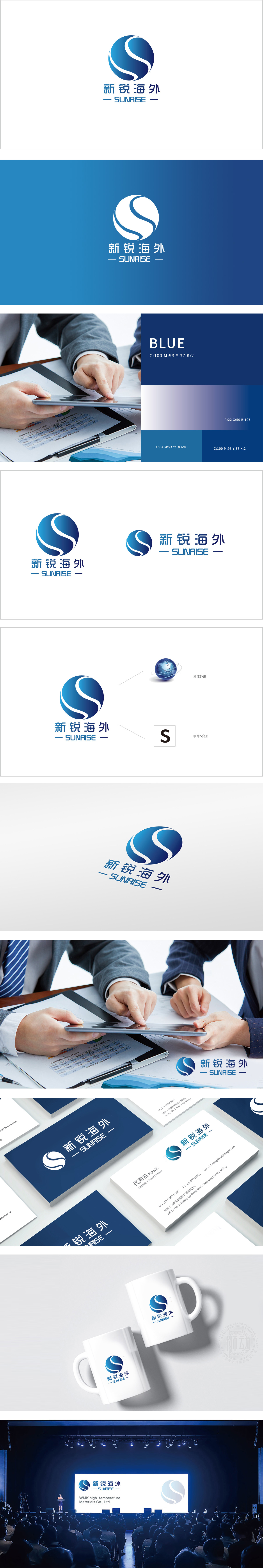
狮动设计通过蓝色球体作为视觉主体,直观传递“全球化”“跨境”的业务属性,符合“海外”品牌名称的语义联想。球体的3D光影处理增强立体感,既象征覆盖全球的业务版图,也通过蓝色(信任、专业)的色彩选择,建立金融/跨境服务领域所需的可靠形象。字母“S”变形:品牌名称与视觉符号的强关联,形成“连接”“动态”的隐喻——暗合海外业务中“资源链接”“高效流通”的核心价值。通过地球与S形的组合,将抽象的“海外服务”转化为可感知的视觉符号;通过色彩与名称的协同,传递专业与创新的双重品牌性格;最终为品牌在全球化竞争中构建了“既可靠又新锐”的差异化形象。
Lion Design uses the blue sphere as the visual subject, which intuitively conveys the business attributes of "globalization" and "cross-border" and conforms to the semantic association of "overseas" brand names. The 3D light and shadow processing of the sphere enhances the three-dimensional sense, which not only symbolizes the business map covering the whole world, but also establishes a reliable image needed in the financial/cross-border service field through the color selection of blue (trust and professionalism). Distortion of the letter "S": the strong correlation between brand names and visual symbols forms a metaphor of "connection" and "dynamic", which coincides with the core values of "resource link" and "efficient circulation" in overseas business.


扫码或拨打添加客服微信


