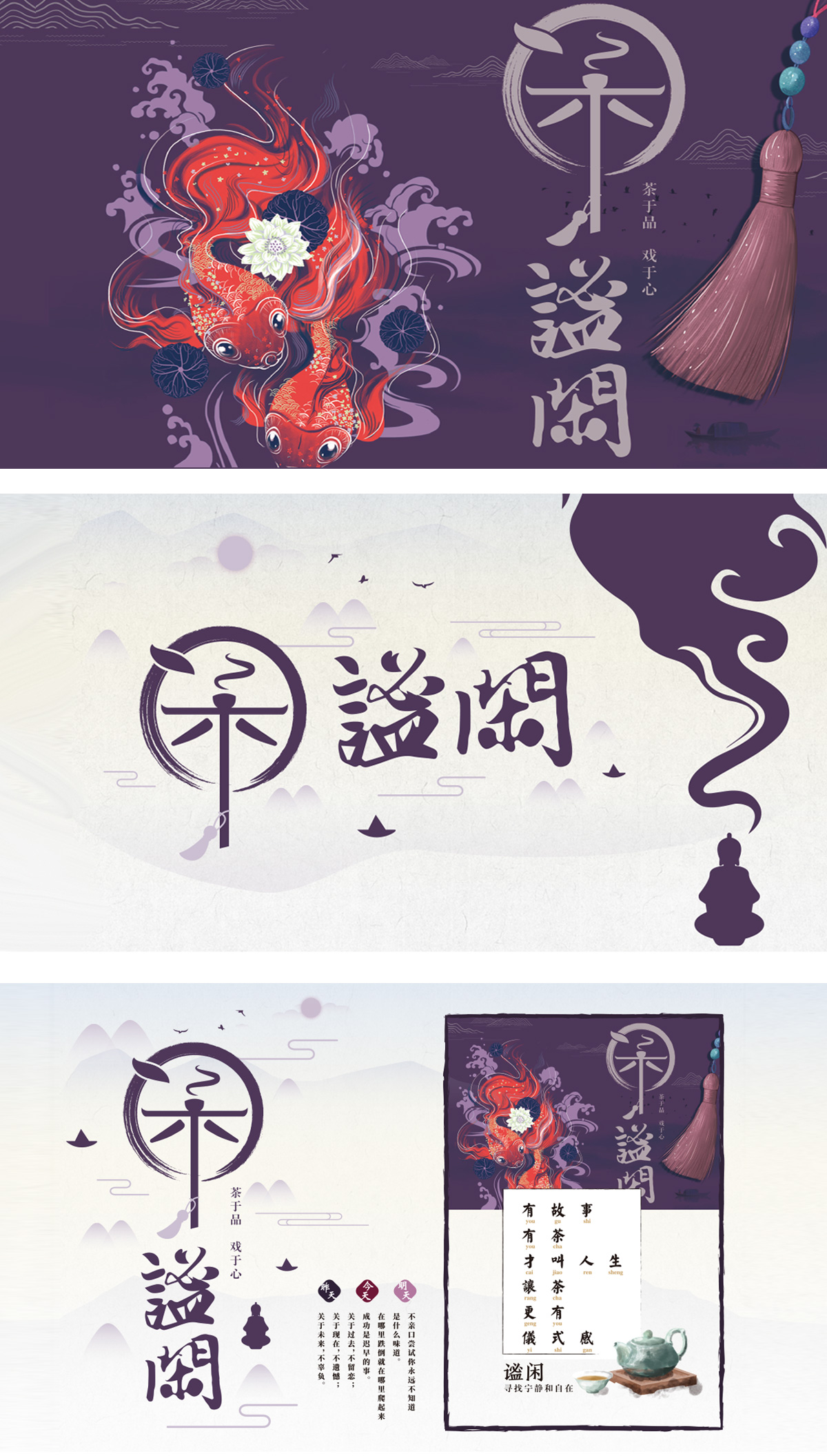
狮动设计将主体“闲”字突破了常规书法字体的静态呈现,通过图形化重构实现了多重语义承载:以半开放的圆形轮廓,隐喻“动静相生”的品茗哲学;元素嵌套:内部暗藏的茶叶形态与茶杯轮廓,直接锚定“茶”的行业属性,这种“字中有物”的设计,让行业特征与核心概念(闲)自然融合;传递出“闲逸”的动态意境。色彩上,深紫/墨黑的主色调沉稳内敛,符合传统茶文化“素雅高洁”的调性,整体“以一字统摄万物”的设计逻辑,既保留了中式美学的含蓄意境,又通过图形化处理让传统文化符号具备了现代视觉的识别效率,堪称“小而美”的中式茶品牌视觉设计范本。
Lion design breaks through the static presentation of conventional calligraphy fonts with the word "leisure" as the main body, and realizes multiple semantic loads through graphic reconstruction: it uses a semi-open circular outline to metaphor the philosophy of "dynamic and static" tea tasting; Element nesting: the hidden tea form and the outline of the teacup directly anchor the industry attribute of "tea". This design of "there is something in the word" naturally integrates the industry characteristics with the core concept (leisure); It conveys the dynamic artistic conception of "leisure". In terms of color, the main color of deep purple/jet black is calm and restrained, which conforms to the tonality of traditional tea culture, and the overall design logic of "controlling everything with one word" not only retains the implicit artistic conception of Chinese aesthetics.


扫码或拨打添加客服微信


