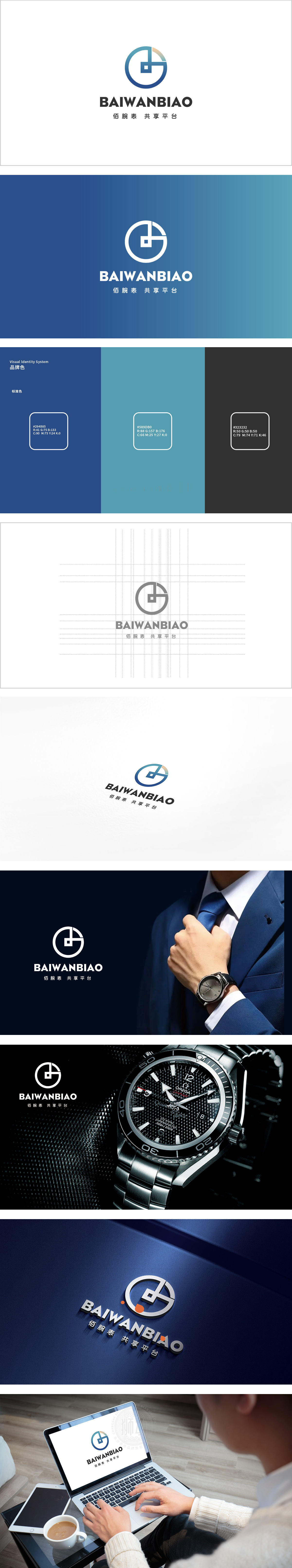
狮动设计以圆形为基底,环形设计既是钟表的经典形态,又象征“循环”“共享”的平台属性——寓意资源流转、用户连接的闭环生态。小正方形作为“G”的一部分,如同“表盘”中的刻度或核心区域,象征精准、专业,也隐喻“资源入口”表达了“腕表”“共享”“科技平台”三大核心要素:该LOGO通过“符号隐喻+色彩心理+结构平衡”的组合,成功实现了“简洁而不简单”的视觉效果:展现了对“功能与美学统一”的把控能力。
Lion design is based on a circle, and the ring design is not only a classic form of watches, but also a platform attribute of "circulation" and "sharing"-a closed-loop ecology of resource circulation and user connection. As a part of the "G", the small square, like the scale or core area in the dial, symbolizes precision and professionalism, and also expresses the three core elements of "wristwatch", "sharing" and "technology platform" by metaphor: the LOGO successfully realizes the visual effect of "simplicity but not simplicity" through the combination of symbol metaphor+color psychology+structural balance.


扫码或拨打添加客服微信


