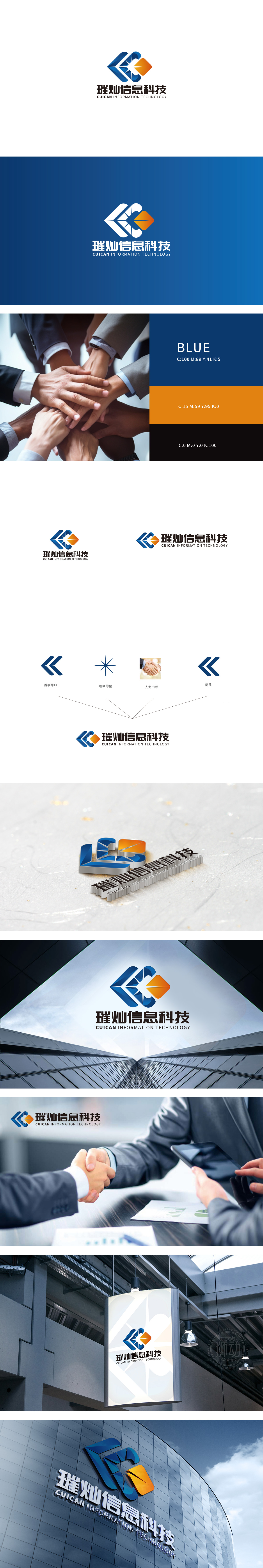
狮动设计以“首字母CC”对称箭头形态呈现,蓝色调传递科技属性,双箭头的动态感既呼应“C”的字母结构,又暗含协作与双向赋能的行业特性;“璀璨的星”采用放射状星形设计,线条锐利且富有张力,与“人力白领”的握手意象形成对比——前者象征创新突破,后者传递专业服务中的信任联结;设计通过结构化拆解与重组,成功将“科技+人力服务”的复合定位转化为可感知的视觉语言,每个元素都服务于“专业、创新、协作”的品牌内核,展现出对行业属性与品牌个性的深度理解。
Lion design is presented in the form of a symmetrical arrow with the initial letter CC, and the blue tone conveys the scientific and technological attributes. The dynamic feeling of the double arrows not only echoes the letter structure of "C", but also implies the industrial characteristics of cooperation and two-way empowerment. "Bright Star" adopts radial star design, with sharp lines and rich tension, which is in contrast with the handshake image of "human white-collar workers"-the former symbolizes innovation and breakthrough.


扫码或拨打添加客服微信


