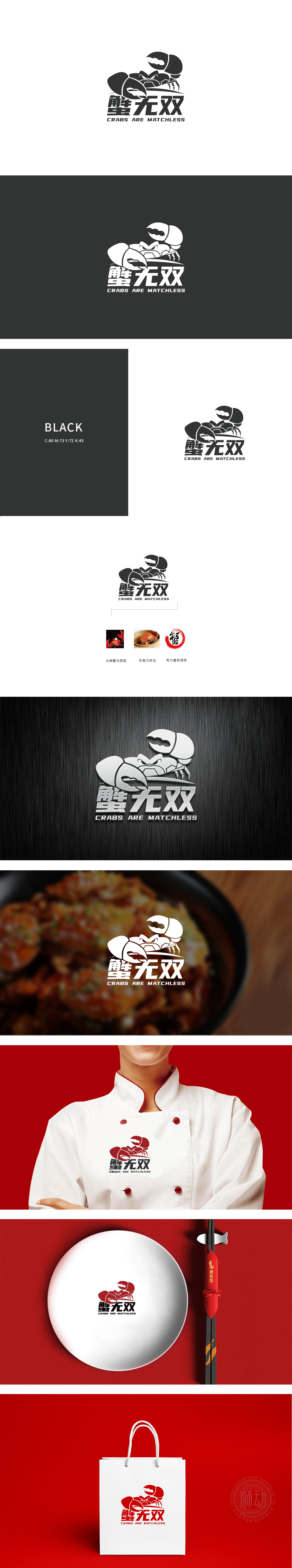
狮动设计以大闸蟹为核心原型,通过几何化概括,将具象生物转化为抽象符号。夸张的对称螯钳占据视觉中心,边缘采用硬朗的直线与锐角,既保留了蟹钳的“力量感”,又通过简化形态强化记忆点,符合“无双”所传递的“霸气”与“独特性”品牌调性。整体采用单色黑+负空间手法,线条粗细对比明确,“以品类特性为根、以品牌调性为魂”的设计思路,正是其“设计能力”的核心体现——既懂美学,更懂商业。
Lion design takes hairy crabs as the core prototype, and transforms concrete creatures into abstract symbols through geometric generalization. Exaggerated symmetrical pincers occupy the visual center, and the edges adopt tough straight lines and acute angles, which not only retains the "sense of strength" of crab pincers, but also strengthens the memory points by simplifying the shape, which conforms to the brand tonality of "domineering" and "uniqueness" conveyed by "unparalleled".


扫码或拨打添加客服微信


