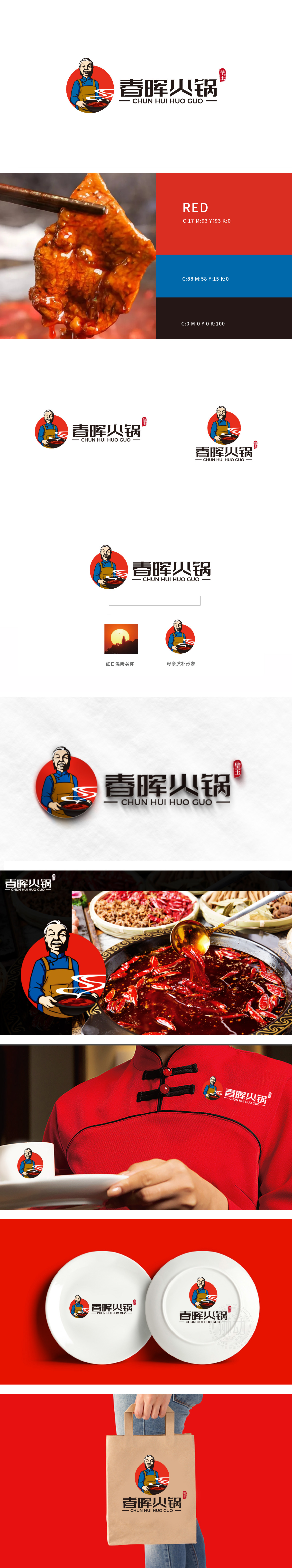
狮动设计通过“人物IP+产品场景”锚定品类认知,质朴母亲的“烟火气”传递,采用手绘风格的中年女性形象,身着蓝色上衣与棕色围裙,手持冒着热气的火锅——这一“母亲”符号精准切中餐饮品牌的情感需求:微笑的面容、自然的持锅动作,通过非语言符号传递“温暖”“亲切”的情绪价值,暗合“春晖”(含“春日暖阳般的关怀”之意)的品牌名寓意,让消费者联想到“回家吃饭”的熟悉场景。整体画面以”红日温暖关怀”的意象,与母亲形象形成“自然意象(温暖)—人文形象(关怀)”的呼应,通过“天(红日)—人(母亲)—食(火锅)”的三层关联,构建“自然馈赠+人文守护”的品牌叙事,让“春晖”的文化内涵(感恩、温暖)不再是空洞的文字,而是可感知的视觉符号。传递了“有温度、有故事”的品牌。
Lion design anchors category cognition with "people IP+ product scene", conveys simple mother's "fireworks", and adopts hand-painted middle-aged female image, dressed in blue coat and brown apron, holding steaming hot pot. This "mother" symbol accurately hits the emotional needs of catering brands: smiling face, natural pot holding action, and conveying "warm" and "cordial" emotional value through nonverbal symbols. With the image of "red sun's warmth and care", the whole picture echoes with the image of mother's "natural image (warmth)-humanistic image (care)", and through the three-layer connection of "heaven (red sun)-people (mother)-food (hot pot)", the brand narrative of "natural gift+humanistic protection" is constructed, so that the cultural connotation of "spring glow" can be realized. Delivered the brand of "temperature and story".


扫码或拨打添加客服微信


