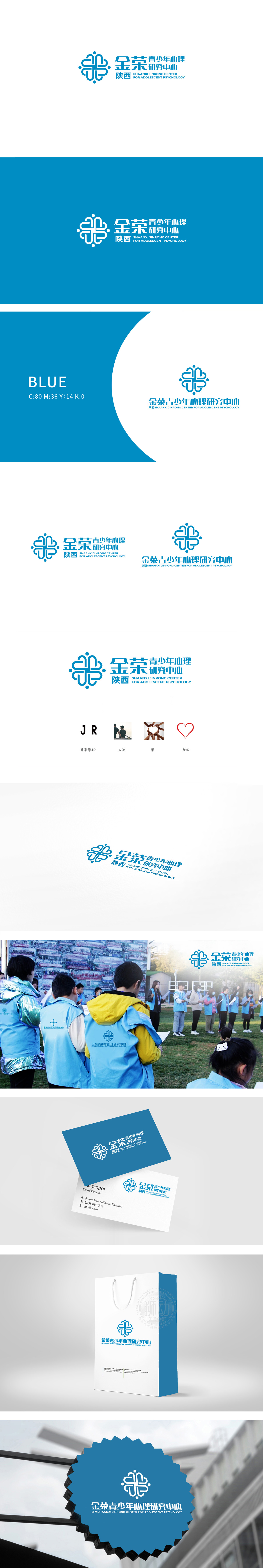
狮动设计以抽象的“线条交织”为基础,形似多个“心”形轮廓的动态连接,既直观关联“心理研究”的核心——关注青少年内心世界,又通过“交织”“循环”的形态象征“沟通”“支持”“成长路径”,传递出心理学中“关系建立”“情绪疏导”的专业属性。同时,图形边缘的圆角处理与对称结构,赋予视觉柔和感,符合青少年心理服务机构温暖、包容的气质。蓝色在视觉语言中常与“信任”“理性”“专业”相关联,符合“研究中心”的学术属性,传递严谨、科学的品牌形象;整体成功塑造了“专业严谨+温暖包容”的品牌形象。
Lion design is based on the abstract interweaving of lines, which is similar to the dynamic connection of multiple heart-shaped outlines. It not only intuitively relates the core of psychological research-paying attention to the inner world of teenagers, but also conveys the professional attributes of relationship building and emotional counseling in psychology through the interweaving and circulating forms. At the same time, the rounded corners and symmetrical structure of the graphic edges give a soft sense of vision, which conforms to the warm and inclusive temperament of the youth psychological service institutions.


扫码或拨打添加客服微信


