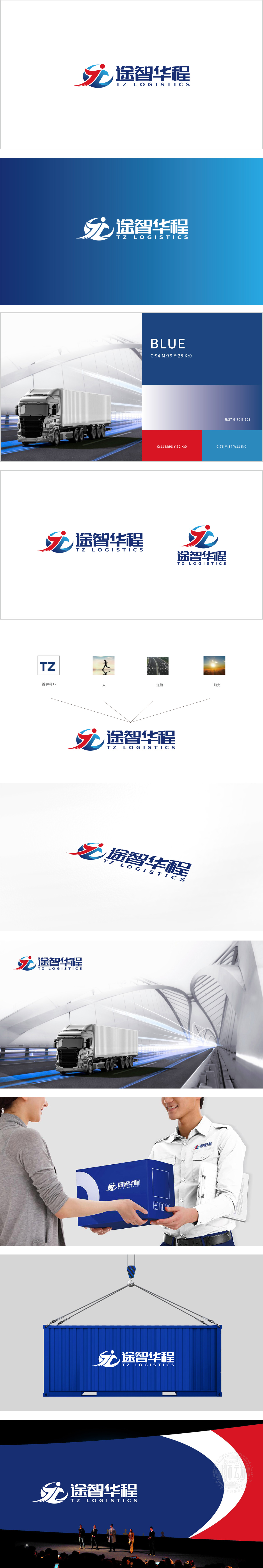
狮动设计采用 红蓝过双色人物剪影:互补型人才结构,红色与蓝色代表两类核心人才特质:红色象征激情、行动力,蓝色象征理性、智慧。两者相互交织、环绕,暗示企业重视“多元能力互补”,通过不同类型人才的协同形成合力,对应人力资源中的“团队配置优化”与“角色互补”策略。人物姿态呈“向上托举”的动态感,红色部分的“扬起衣角”似能量释放,传递“激发人才潜能”的理念,呼应人力资源中“激励机制”“职业发展通道”的设计目标——让个体价值在团队中最大化。整体图形以圆形为基底,象征开放、包容的组织氛围,对应人力资源中的“企业文化建设”,强调打破边界、鼓励协作;而内部“人”字形结构为核心,直接点明“以人为本”的价值观,将人才视为企业发展的根本驱动力。
esign adopts red and blue silhouette: complementary talent structure. Red and blue represent two kinds of core talents: red symbolizes passion and action, and blue symbolizes rationality and wisdom. They are intertwined, suggesting that enterprises attach importance to "multi-ability complementarity" and form a joint force through the cooperation of different types of talents, which corresponds to the strategies of "team configuration optimization" and "role complementarity" in human resources. The posture of the characters shows a dynamic sense of "upward lift", and the red part of "raising the skirt" is like energy release.conveying the concept of "stimulating the potential of talents" and echoing the design goal of "incentive mechanism" and "career development channel" in human resources-maximizing individual value in the team.


扫码或拨打添加客服微信


