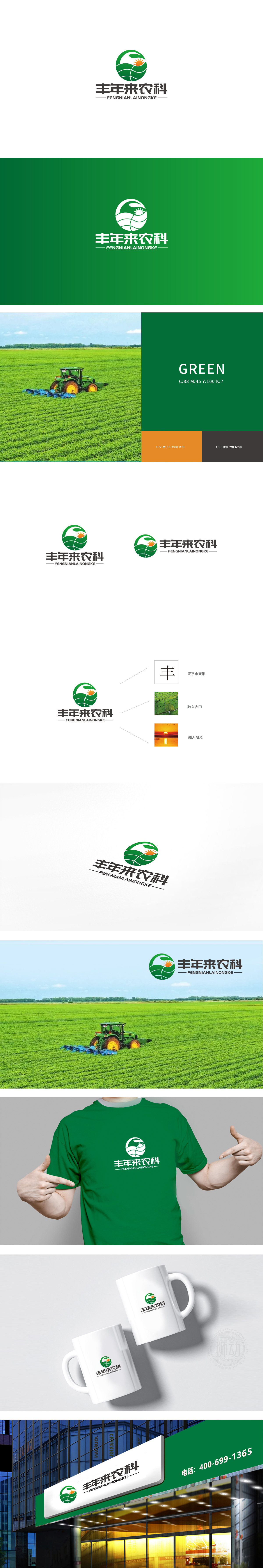
狮动设计采用圆形构图,既象征地球,也寓意“圆满、丰收”的美好愿景。圆形的封闭性结构暗含农业生产的循环性(如“种植-生长-收获-再种植”),强化了品牌与自然生态的紧密联系。绿色主色调:传递自然与生机,标志以深浅不同的绿色为主色,直接关联“土地、作物、生态”,直观传递出农业领域的自然属性和可持续发展理念,同时给人以健康、环保的视觉联想。通过“色彩象征、抽象图形隐喻、元素逻辑关联”三大设计策略,将农业领域的“自然、土地、生长、丰收”等核心概念转化为简洁而富有深意的视觉符号。
Lion design adopts a circular composition, which not only symbolizes the earth, but also symbolizes the beautiful vision of "perfection and harvest". The circular closed structure implies the circulation of agricultural production (such as "planting-growing-harvesting-replanting"), which strengthens the close relationship between the brand and the natural ecology. Main color of green: it conveys nature and vitality, and the logo is dominated by different shades of green, which directly relates to "land, crops and ecology", intuitively conveys the natural attributes and sustainable development concept of agriculture, and at the same time gives people a healthy and environmentally friendly visual association.


扫码或拨打添加客服微信


