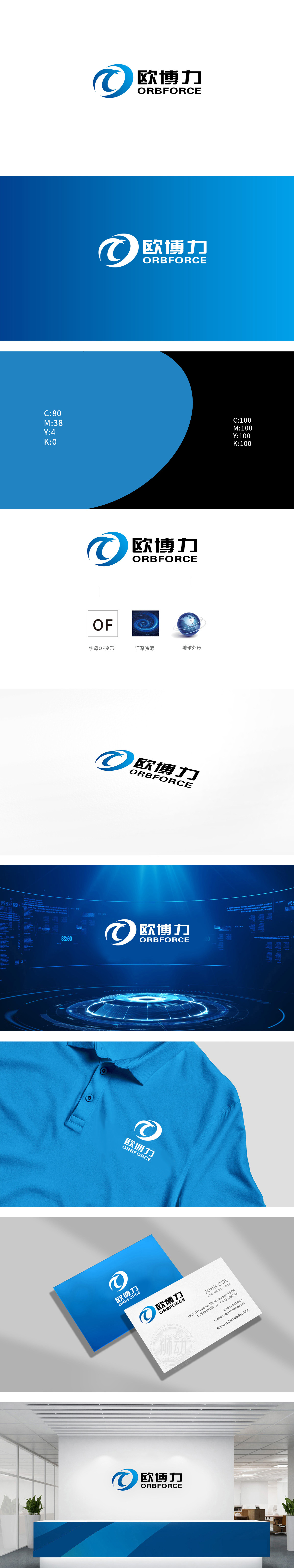
狮动设计以蓝色渐变的环形为主体,嵌入抽象的“飞鸟”轮廓。环形象征科技的循环、完整与全球化视野,而飞鸟的动态线条则传递出速度、突破与前瞻性,又通过向上的形态强化了“力量”与“进取”的品牌气质。蓝色作为科技领域的经典配色,传递出理性、专业与可靠感,整体通过“环形”(科技、全球化)与“飞鸟”(动态、突破)的组合,直观传递出品牌在科技领域的创新能力与行动力,“欧博力”的命名也暗含“卓越、博大、力量”的寓意,整体设计简洁而不失细节,适合在科技、智能设备等领域进行品牌延伸。
Lion design is based on the blue gradient ring, embedded in the abstract "bird" outline. The ring symbolizes the cycle, integrity and global vision of science and technology, while the dynamic lines of birds convey speed, breakthrough and foresight, and strengthen the brand temperament of "strength" and "enterprising" through the upward form. As a classic color scheme in the field of science and technology, blue conveys a sense of rationality, professionalism and reliability. As a whole, through the combination of "ring" (science and technology, globalization) and "flying bird" (dynamic and breakthrough).


扫码或拨打添加客服微信


