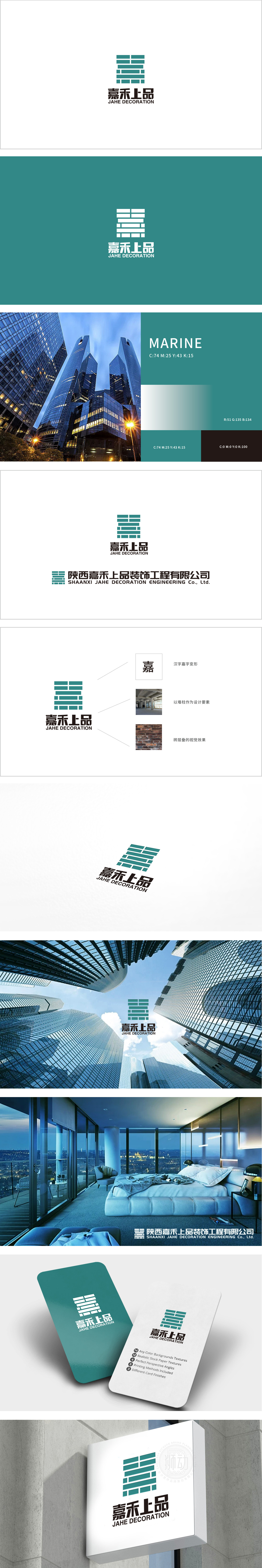
狮动设计以“建筑根基”隐喻家居品质,绿色横纵线条,灵感源自“墙柱结构”与“砖层叠视觉”,既呼应了建筑装饰行业的核心-空间骨架与材质工艺,传递“结构美学”与“细节匠心”。 绿色作为主色调,既象征“环保、自然”的家居理念,又与品牌名形成联想,传递“踏实、可靠、有生命力”的品牌气质,符合家居装饰行业对“安全、舒适、持久”的价值追求。墙柱是建筑的“骨骼”,砖层是材质的“肌理”,Logo将这两个最基础的建筑符号提炼为视觉语言,暗喻家居装饰的本质——以结构为基,以材质为表,以人文为魂。用建筑的“结构感”传递家居的“稳固品质”,用材质的“肌理感”暗示工艺的“细节打磨”,用文字的“文化感”提升品牌的“人文温度”。
Lion design uses "architectural foundation" as a metaphor for home quality and green horizontal and vertical lines, and is inspired by "wall-column structure" and "brick layered vision", which not only echoes the core of architectural decoration industry-space skeleton and material technology, but also conveys "structural aesthetics" and "details ingenuity". As the main color, green not only symbolizes the home concept of "environmental protection and nature", but also forms an association with the brand name, conveying the brand temperament of "sureness, reliability and vitality", which is in line with the value pursuit of "safety, comfort and durability" in the home decoration industry.


扫码或拨打添加客服微信


