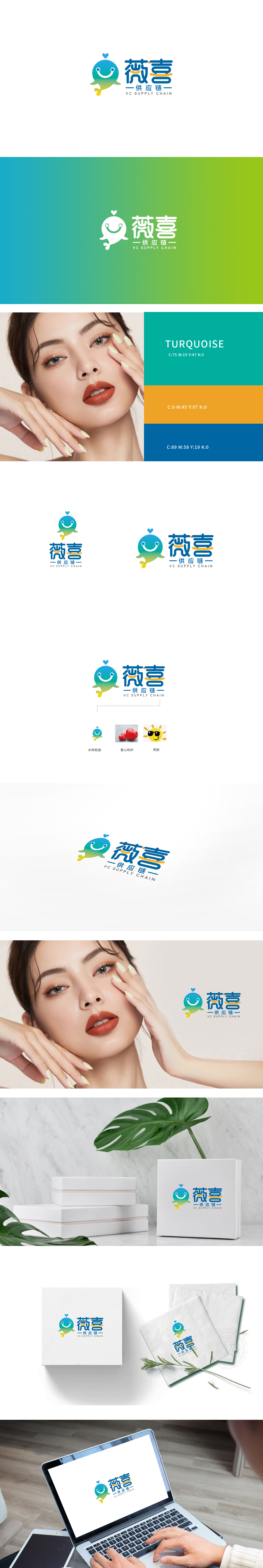
狮动设计采用拟人化海洋生物,传递“温和、安全、滋养”的供应链属性,面部带有微笑表情,顶部的小爱心符号强化了“亲和力”。这种设计与美容行业对“温和成分、安全品控”的核心诉求高度契合。色彩上,蓝绿色渐变从深海蓝过渡到浅绿,象征“专业严谨”到“自然鲜活”的供应链全链路,薇喜”用拟人化生物替代机械符号,传递“以客户为中心”的服务理念——美容供应链不仅是“物流、生产、仓储”的串联,更是“需求洞察、柔性定制、品控保障”的综合服务。
Lion design uses anthropomorphic marine life to convey the supply chain attributes of "gentleness, safety and nourishment", with a smiling expression on the face and a small love symbol at the top to strengthen "affinity". This design is highly consistent with the core demands of the beauty industry for "gentle ingredients and safe quality control". In color, the blue-green gradient changes from deep blue to light green, symbolizing the whole supply chain link from "professional rigor" to "natural vividness".Weixi uses anthropomorphic creatures instead of mechanical symbols to convey the service concept of "customer-centered"-the beauty supply chain is not only a series of logistics.


扫码或拨打添加客服微信


