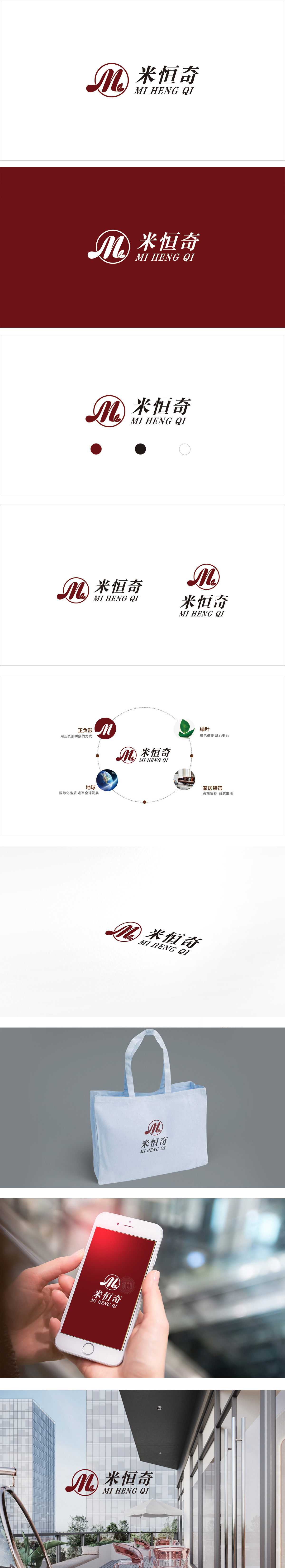
狮动设计以圆形+“M”+叶子组合,是整个设计的灵魂:圆形边框:用传统器物的形态,传递“圆满、可靠、永恒”的质感,很符合“米恒奇”这类注重“长久品质”的品牌定位,“M”字母:作为“米”的首字母,用书法笔触的曲线呈现,既有中国风的典雅,又有流动的动感,打破了字母的生硬感,暗示品牌的“传统与创新结合”;通过深酒红的温馨、圆形的包容、叶片的自然,传递出“经典、温馨、自然”的品牌调性,对应家居装饰风格应围绕“质感优先、温馨有细节、自然不刻意”展开。
Lion design is the soul of the whole design with the combination of circle+"M"+leaves. Round border: it uses the form of traditional utensils to convey the texture of "perfection, reliability and eternity", which is in line with the brand positioning of "Mi Hengqi" which pays attention to "long-term quality". The letter "M", as the initial letter of "Mi", is presented by the curve of calligraphy strokes, which not only Through the warmth of deep wine red, circular tolerance and natural leaves, the brand tonality of "classic, warm and natural" is conveyed, and the corresponding home decoration style should focus on "texture first, warmth with details, nature without intention".


扫码或拨打添加客服微信


