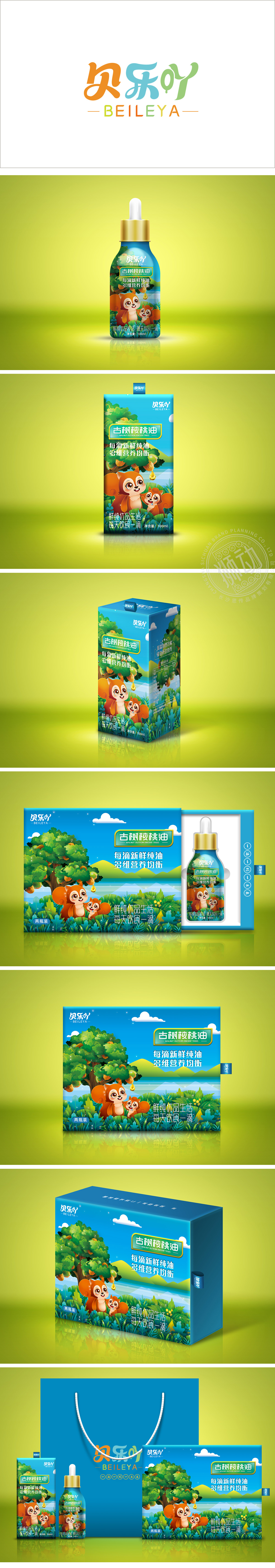
狮动设计采用渐变蓝绿色,呼应“古树”“核桃油”的天然属性,,符合母婴/儿童产品的温和调性。瓶盖与标签边框使用金色,提升产品质感,同时与瓶身的自然色形成对比,增强视觉焦点。背景环境选择柔和的黄绿色渐变,模拟阳光照射下的自然场景,进一步强化“新鲜”“天然”的产品联想。以“松鼠+核桃树”为视觉主体,配合底部的草地、叶片等元素,形成完整的“森林小剧场”场景,吸引儿童注意力。高亲和力的情感连接亲子松鼠互动(母松鼠与小松鼠)传递“呵护”“健康成长”的情感价值,整体通过“可爱卡通形象+自然场景+精准卖点”**的三重组合,将“古树核桃油”的“天然、营养、儿童专属”等核心信息转化为直观的视觉语言。
Lion design adopts gradient blue-green, echoing the natural attributes of "ancient trees" and "walnut oil", and conforming to the mild tonality of maternal and infant/children products. The bottle cap and label frame are made of gold, which enhances the texture of the product and contrasts with the natural color of the bottle body to enhance the visual focus. Soft yellow-green gradient is selected in the background environment to simulate the natural scene under sunlight, and further strengthen the association of "fresh" and "natural" products. Taking "Squirrel+Walnut Tree" as the visual subject, combined with grass, leaves and other elements at the bottom, a complete "small forest theater" scene is formed to attract children's attention.


扫码或拨打添加客服微信


