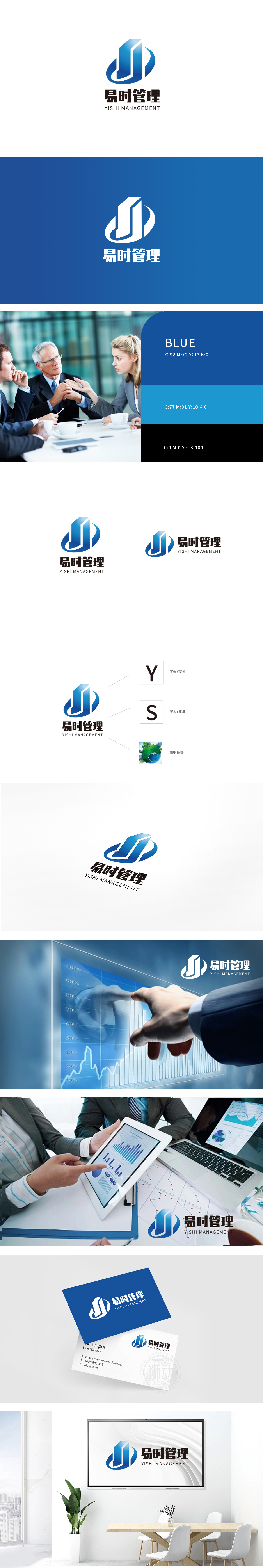
狮动设计以抽象的“J”形结构为主体,融合了“建筑/柱状体”与“环绕弧线”两大核心视觉符号,形成兼具“稳固感”与“动态感”的矛盾统一:通过渐变蓝色增强体积感,既呼应“管理”行业所需的专业稳重,又以倾斜角度打破静态,暗示“积极向上、高效进取”的品牌气质。柱体内部的白色分割线强化了结构清晰度,隐喻管理工作的“条理性”与“逻辑性”。主色调选用深蓝色系,蓝色在色彩心理学中对应“信任、专业、可靠”,符合管理咨询、企业服务类品牌的行业属性;用最简洁的几何语言,承载了“专业、高效、协作、发展”四重品牌内涵。
Lion Design takes the abstract * * "J"-shaped structure * * as the main body, and integrates the two core visual symbols of "architecture/column" and "surrounding arc", forming a contradictory unity with both "stability" and "dynamic": the sense of volume is enhanced by gradually changing the blue color, which not only echoes the professional stability required by the "management" industry, but also breaks the static state with an inclined angle, implying "positive" The white dividing line inside the column strengthens the structural clarity and metaphor the "organization" and "logic" of management work.


扫码或拨打添加客服微信


