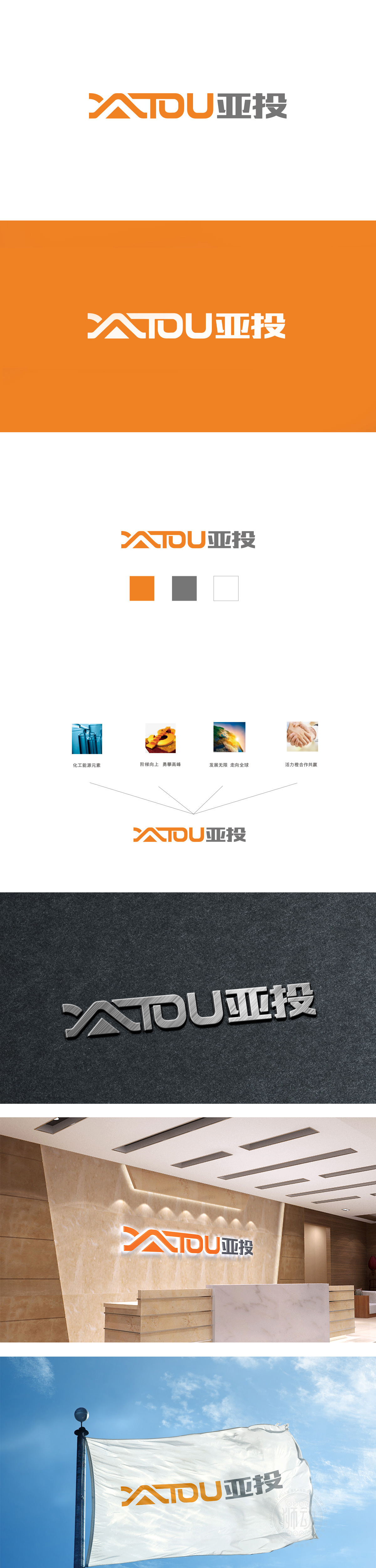
狮动设计采用刚劲有力的字体设计的,融入向上阶梯造型,暗合新能源发展的进阶之路。从传统能源到清洁能源的跨越,每一步都如攀登阶梯。“阶梯向上 勇攀高峰”,在此化为视觉动能,预示亚投在新能源技术与市场拓展上的不懈登攀,每道线条都是进步的刻度。色彩采用橙色元素,象征着亚投在该领域的根基与活力。整体图形简洁勾勒出亚投的能源雄心——以创新能源方案,照亮世界每个角落,线条间流动的是突破地域、连接全球的能源梦想。
Lion design is designed with strong fonts, integrated with upward ladder modeling, which coincides with the advanced road of new energy development. From traditional energy to clean energy, every step is like climbing a ladder. "Climb the peak by steps" is transformed into visual kinetic energy here, which indicates that Yatou has made unremitting progress in new energy technology and market expansion, and each line is a scale of progress. The color adopts orange element, which symbolizes the foundation and vitality of Yatou in this field. The overall figure succinctly outlines the energy ambition of Yatou-to illuminate every corner of the world with innovative energy solutions.


扫码或拨打添加客服微信


