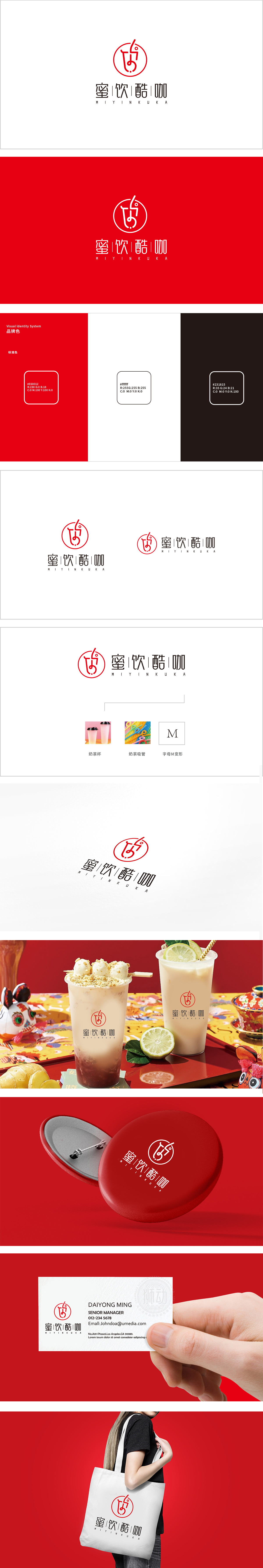
狮动设计采用符号化的“奶茶基因”浓缩,红色圆形内的抽象符号是设计的点睛之笔——形似一杯倾斜的奶茶杯,杯口的弧线与右侧向上扬起的“吸管”线条形成动态呼应,既像正在饮用奶茶的瞬间,又暗藏“M”(品牌首字母)的变形轮廓,将“奶茶杯”“吸管”“品牌字母”三重元素无缝衔接,简洁却信息量丰富。。用一个符号承载品牌名(M)、产品形态(杯+吸管)、行业属性(奶茶)和情绪价值(活力),让人联想到饮用奶茶时的轻松、愉悦场景,符合年轻消费者对“休闲、活力”的心理期待。
Lion design is concentrated by symbolic milk tea gene, and the abstract symbol in the red circle is the finishing touch of the design-it looks like an inclined milk tea cup, and the arc of the cup mouth dynamically echoes with the line of "straw" raised upward on the right side, which is like the moment when milk tea is being drunk, but also hides the deformed outline of "M" (brand initials), and changes the "milk tea cup", "straw" and "brand letters" into three parts. . Using a symbol to carry the brand name (M), product form (cup+straw), industry attribute (milk tea) and emotional value (vitality) reminds people of the relaxed and pleasant scene .


扫码或拨打添加客服微信


