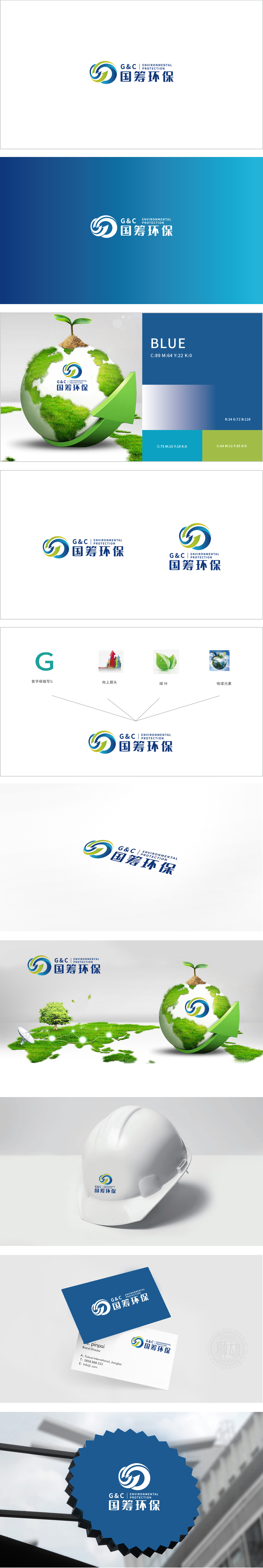
狮动设计采用两个环绕旋转的环形箭头,形成“G&C”字母的抽象融合,同时暗合“循环经济、资源再生”的环保核心,线条从底部交汇向上发散,呼应“向上箭头”的积极动势,形成“汇聚力量→持续发展→全球视野”的视觉叙事链条。蓝色象征科技与专业,绿色象征生态,双色调融合体现“科技赋能环保”的品牌定位。将“字母G”“箭头”“绿叶”“地球”四大分散元素,通过环形流线、色彩呼应、抽象隐喻等方式融为一体,直观传递出企业积极进取、持续发展的态势,与环保行业“进步、优化、可持续”的核心价值观高度契合。
Lion Design adopts two circular arrows that revolve around each other to form an abstract fusion of the letters "G&C", and at the same time coincides with the environmental protection core of "circular economy and resource regeneration". The lines converge from the bottom and diverge upward, echoing the positive momentum of "upward arrow", forming a visual narrative chain of "gathering strength → sustainable development → global vision". Blue symbolizes technology and specialty, green symbolizes ecology, and the integration of two colors reflects the brand positioning of "technology empowerment and environmental protection" The four scattered elements of "letter G", "arrow", "green leaf" and "earth" are integrated into one by means of circular streamline.


扫码或拨打添加客服微信


