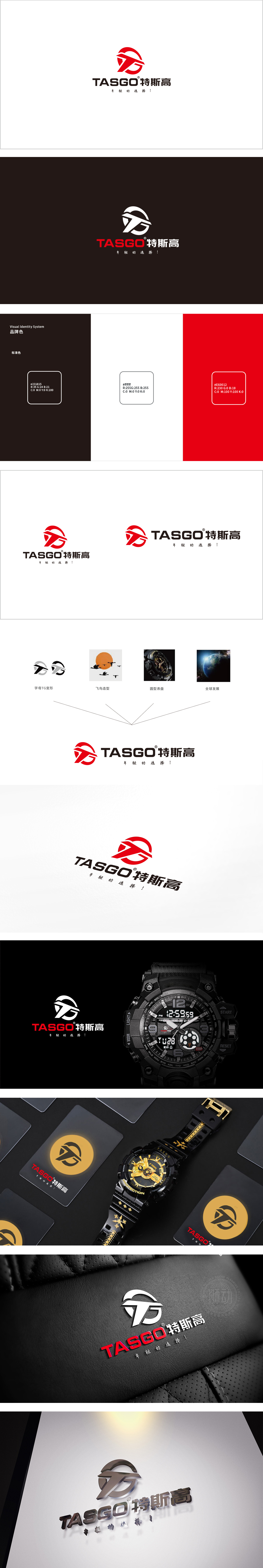
狮动设计以抽象化的“T”和“G”为基础,线条锐利且富有动感,形似手表指针的动态延伸,传递“精准计时”与“活力”;LOGO中融入了飞鸟的造型元素。飞鸟象征着自由、进取和高远的视野,传达了公司积极向上、追求卓越的企业精神。圆形元素演化为红色环形轮廓,既呼应表盘形态,又象征时间的循环与完整,强化“手表”的核心品类认知。整体以简约线条勾勒群雁南飞,传递轻盈、向上的动态感,与手表“年轻的选择!”的品牌主张呼应——象征年轻群体突破时间束缚的自由态度,同时飞鸟的流线型轮廓与手表设计中的“轻薄、动感”美学相契合。
Lion design is based on abstract "T" and "G", with sharp and dynamic lines, resembling the dynamic extension of watch hands, and conveying "accurate timing" and "vitality"; The LOGO incorporates the modeling elements of birds. Birds symbolize freedom, enterprising and lofty vision, and convey the company's entrepreneurial spirit of being positive and pursuing Excellence. The circular element has evolved into a red circular outline, which not only echoes the dial shape, but also symbolizes the cycle and integrity of time, and strengthens the recognition of the core category of "watches". As a whole, a group of geese flying south are outlined with simple lines, conveying a light and upward dynamic feeling, which is "a young choice!" with the watch.


扫码或拨打添加客服微信


