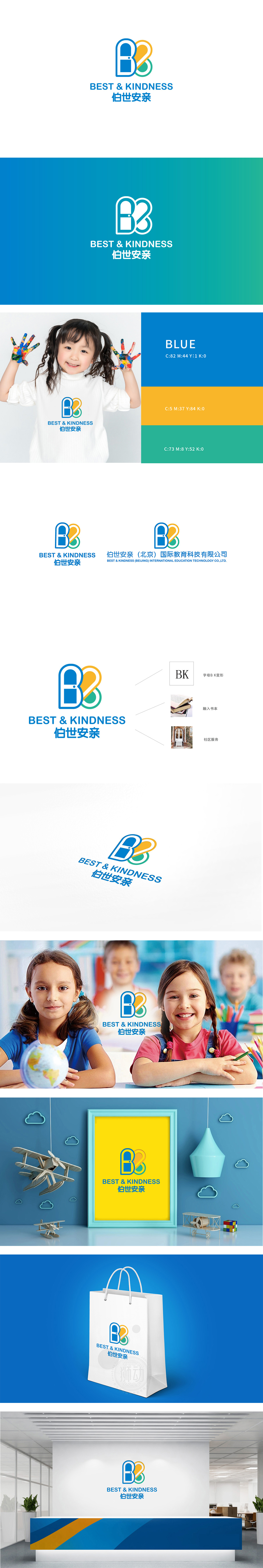
狮动设计以两个抽象的“B”字母为基础,通过流畅的曲线和色彩分层)形成环抱交融的形态,既呼应了品牌名称首字母“BK”,又通过对称结构传递出“陪伴”“守护”的温暖感,贴合“安亲”服务的情感属性。蓝色(沉稳可靠)、橙色(活力关怀)、绿色(成长希望)的配色组合,精准匹配教育场景下对“专业”与“亲和力”的双重需求,色彩明快且具有记忆点。整体用极简的图形语言承载了多重信息:既通过字母变形保证了品牌识别的独特性,又通过色彩、线条、辅助关键词传递了“教育+社区+关怀”的复合定位,实现了“商业符号”与“情感共鸣”的双重功能。
Lion design is based on two abstract "B" letters, and forms a form of embracing and blending through smooth curves and color layering, which not only echoes the initial letter "BK" of the brand name, but also conveys the warmth of "companionship" and "protection" through a symmetrical structure, which fits the emotional attribute of "caring for parents" service. The color combinations of blue (calm and reliable), orange (energetic care) and green (growth hope) accurately match the dual needs of "professionalism" and "affinity" in the educational scene, and the colors are bright and memorable.


扫码或拨打添加客服微信


