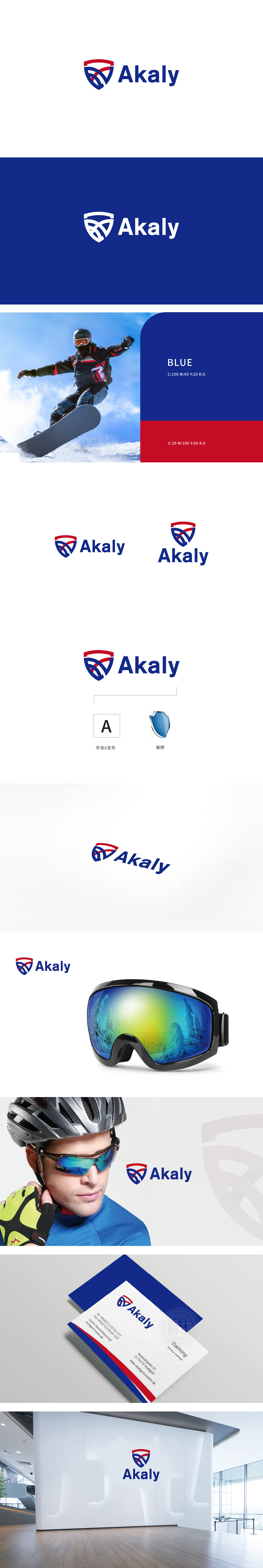
狮动设计采用盾牌轮廓:红色顶部与蓝色主体构成的盾牌造型,既传递出“防护”“专业”的信任感,又通过几何切割增强了现代感,避免传统盾牌的厚重感。内部交叉的红色与白色曲线,形似运动员的“冲刺轨迹”或“肌肉线条”,抽象化的运动姿态赋予图形流动性,让静态标志产生“蓄势待发”的视觉张力——这正是体育品牌需要的活力感。红蓝经典撞色(红象征激情、能量,蓝代表科技、专业),高对比度提升辨识度,同时符合国际体育品牌的视觉语言。整体通过“动态线条+专业色彩+结构化图形”的组合,让受众自然联想到“运动、力量、科技支持”等核心概念。
Lion design adopts the outline of shield: the shield shape composed of red top and blue main body, which not only conveys the trust of "protection" and "professionalism", but also enhances the modernity through geometric cutting and avoids the heavy feeling of traditional shields. The red and white curves that intersect internally are similar to athletes' "sprint tracks" or "muscle lines". The abstract movement posture endows the graphics with fluidity.which makes the static signs produce "ready to go" visual tension-this is exactly the sense of vitality that sports brands need.The classic contrast between red and blue (red symbolizes passion and energy.


扫码或拨打添加客服微信


