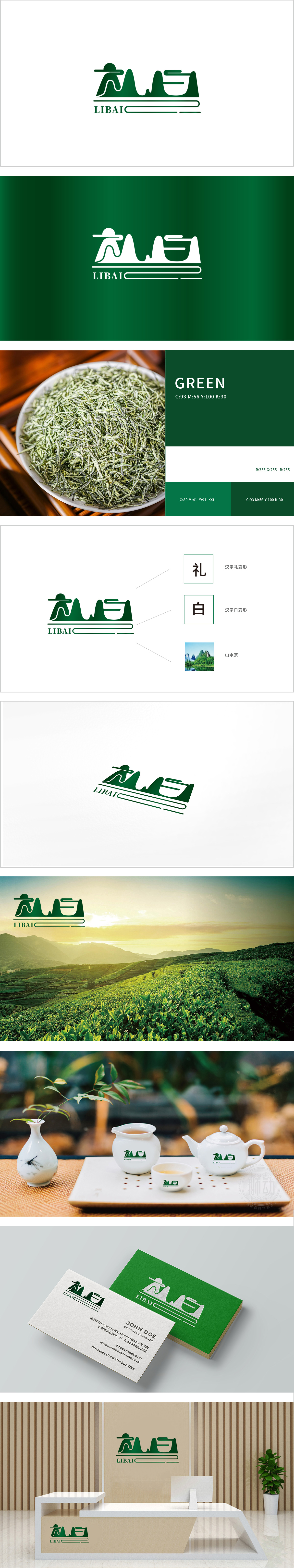
狮动设计以绿色为主色调,图形部分由层叠的山峦轮廓构成主体框架,线条简洁流畅,既呈现了远山的意境,又通过曲线的穿插形成了类似“人”的剪影,这种“山水藏人”的设计,暗合茶品牌常有的“自然、禅意、人文”属性。“山水”意象天然呼应茶的“原产地文化”,而“人在山水间”的场景感,则暗示了品茶时“寄情山水、悠然自得”的消费体验,符合茶作为“慢生活、文化消费”的产品定位。视觉符号的融合:山水、人文与品牌名的呼应,从色彩到意境的精准定位。
Lion design takes green as the main color, and the graphic part is composed of stacked mountain outlines. The lines are simple and smooth, which not only presents the artistic conception of distant mountains, but also forms a silhouette similar to "people" through the interpolation of curves. This design of "Tibetan mountains and rivers" coincides with the attributes of "nature, Zen and humanity" that tea brands often have. The image of "mountains and rivers" naturally echoes the "culture of origin" of tea.


扫码或拨打添加客服微信


