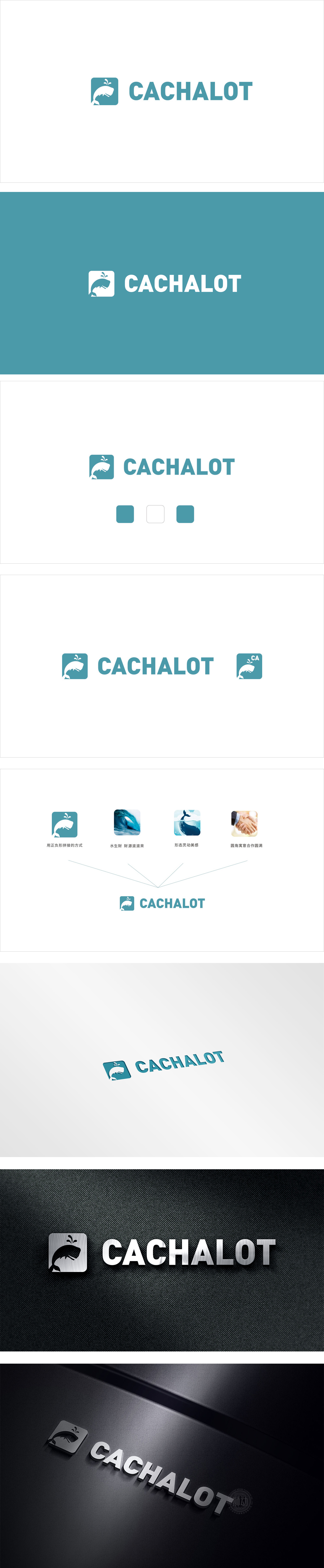
狮动设计采用极简造视觉记忆点,用蓝底白形的正负对比,仅靠几条流畅的线条就勾勒出鲸鱼的轮廓。这种手法既符合现代品牌“简洁易识别”的需求,又像一把“视觉钩子”,让人看一眼就记住了“鲸鱼”这个核心符号。水生财+波浪:用传统寓意接商业地气,又用“水生财”的传统认知,悄悄把品牌和“财富、资源”挂了钩。这种“视觉+寓意”的双管齐下,把商业需求藏在美的形态里,一点都不生硬。这种“动态感”让品牌瞬间跳出了“冰冷的logo”范畴,变得有温度、有活力把“专业感”“实用性”“情感共鸣”揉成了能摸得到、用得着的“影像工具美学”。
Lion design uses minimal visual memory points, and uses the positive and negative contrast of blue background and white shape to outline the outline of whales only by a few smooth lines. This technique not only meets the needs of modern brands for "simplicity and easy identification", but also acts as a "visual hook", which makes people remember the core symbol of "whale" at a glance. Water makes money+waves: the brand is quietly linked with "wealth and resources" by using the traditional meaning to connect with the commercial atmosphere and the traditional cognition of "water makes money". This "visual+moral" two-pronged approach hides business needs in a beautiful form.


扫码或拨打添加客服微信


