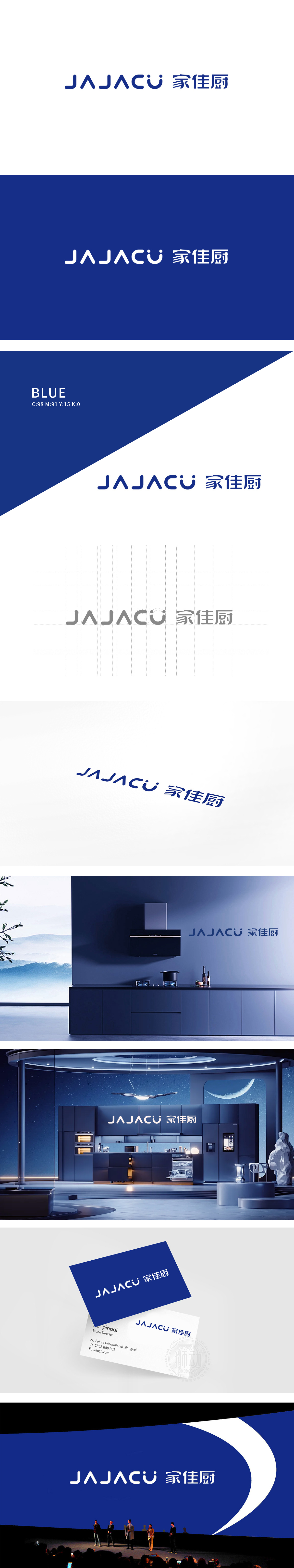
狮动设计以现代简约风格为核心,几何解构与韵律感,突出品牌国际化定位;中文“家佳厨”紧随其后,明确指向“家庭厨房”的核心场景,双语结合覆盖不同受众认知习惯。几何化图形与简洁文字结合,传递品牌专业、高效、贴近生活的属性。蓝色主色调沉稳可靠,契合“厨房”场景对安全、品质的联想,同时体现品牌科技感或规范化的服务理念。整体设计兼具国际感与本土亲和力,符合现代家居生活品牌的视觉趋势,成功塑造了“科技赋能传统厨房,打造高品质家庭生活”的品牌形象。
Lion design takes modern simple style as the core, geometric deconstruction and sense of rhythm, and highlights the international positioning of the brand; Chinese "Jia Jia Kitchen" follows closely, clearly pointing to the core scene of "family kitchen", and bilingual combination covers the cognitive habits of different audiences. The combination of geometric graphics and concise words conveys the brand's professional, efficient and close-to-life attributes. The main color of blue is steady and reliable, which conforms to the association of "kitchen" scene with safety and quality, and at the same time reflects the brand sense of science and technology or standardized service concept.


扫码或拨打添加客服微信


