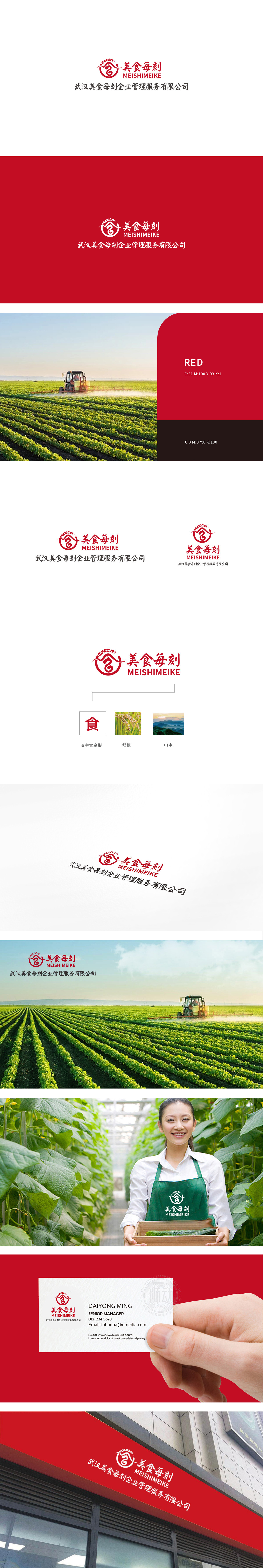
狮动设计以抽象的麦穗为起点(象征“食材本源”和“自然新鲜”),线条自然向下延伸,巧妙勾勒出“碗”的轮廓。这种“食材→器具”的视觉串联,直观传递了品牌与“食物”“饮食”的强关联,整体图形呈圆形包裹,既符合中国人对“圆满”“团聚”的饮食文化心理,传递出“新鲜、活力、时刻相伴”的品牌调性。用最简洁的图形语言(麦穗→碗→圆形),串联起餐饮行业的“食材源头—用餐场景—情感价值”,同时通过色彩、字体、动态感的设计,平衡了“传统餐饮的信任感”与“现代品牌的活力感”。
Lion design starts from the abstract wheat ear (symbolizing "the origin of ingredients" and "natural freshness"), and the lines naturally extend downward, cleverly outlining the outline of the "bowl". This visual series of "ingredients → utensils" intuitively conveys the strong relationship between the brand and "food" and "diet", and the overall figure is wrapped in a circle, which not only conforms to Chinese's catering cultural psychology of "perfection" and "reunion".but also conveys the brand tonality of "freshness, vitality and constant companionship".


扫码或拨打添加客服微信


