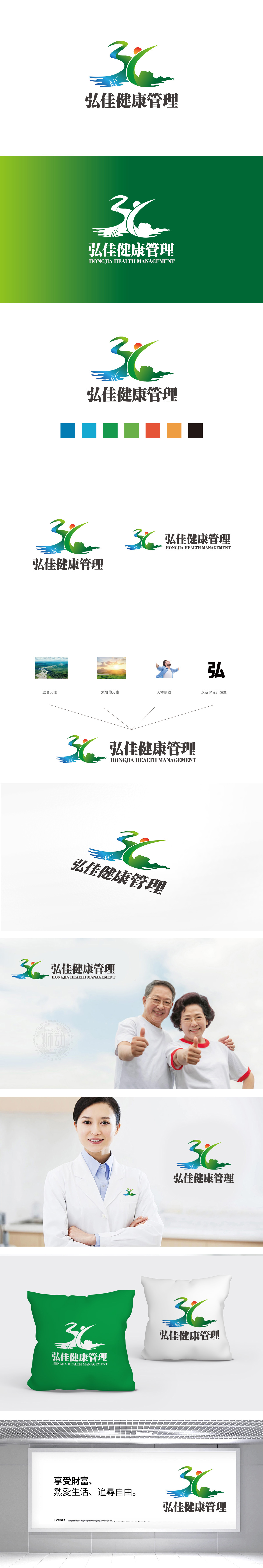
狮动设计采用流动的曲线和抽象人物形态构成,通过色彩与造型的巧妙结合,塑造出多重健康意象:绿色与蓝色渐变:绿色象征生命、健康、自然活力,蓝色代表水的纯净与平和,两种色彩的过渡既呼应了“健康管理”对身心平衡的追求,也传递出清新、专业的品牌气质。“人”与“自然”的共生:向上扬起的绿色曲线抽象为伸展的人形,姿态舒展向上,体现积极运动、健康生活的状态;蓝色曲线模拟流水形态,搭配底部的水波纹与芦苇剪影,营造出自然生态的意境,暗示品牌倡导“顺应自然、身心和谐”的健康理念。通过“人、自然、水、日出”等元素的融合,将抽象的“健康管理”具象化,既强调了“以人为本”的健康服务理念,又让自然元素与之和谐共存。
Lion design is composed of flowing curves and abstract figures. Through the ingenious combination of color and modeling, it creates multiple health images: green and blue gradually change: green symbolizes life, health and natural vitality, and blue represents the purity and peace of water. The transition of the two colors not only echoes the pursuit of physical and mental balance in "health management", but also conveys a fresh and professional brand temperament. The symbiosis of "man" and "nature": the green curve raised upward is abstracted as a stretched human figure, and its posture stretches upward, reflecting the state of active exercise and healthy life; The blue curve simulates the flowing water form, and with the water ripple and reed silhouette at the bottom.


扫码或拨打添加客服微信


