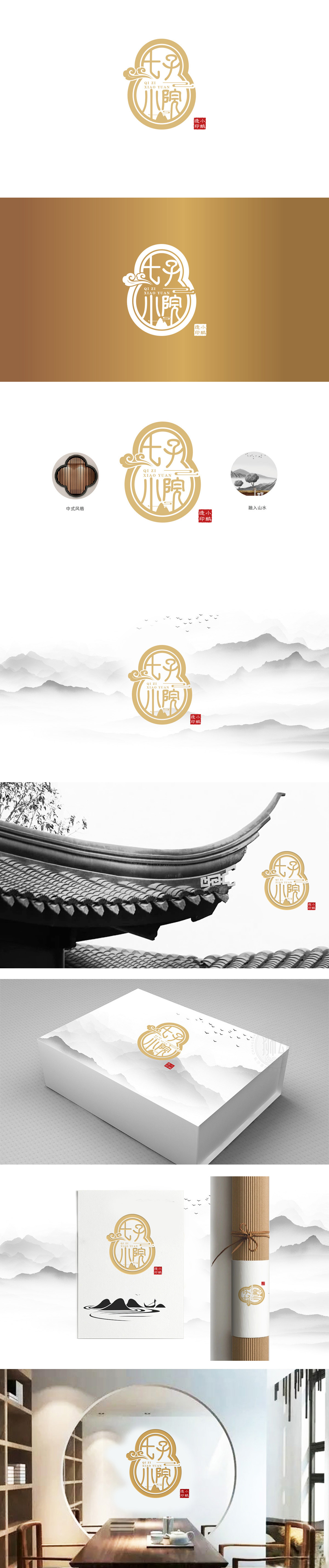
狮动设计采用葫芦轮廓,线条圆润饱满,既保留传统器物的吉祥寓意(葫芦谐音“福禄”,象征吉祥纳福),七子小院”以毛笔书法为基础,体现“传统为体,现代为用”的设计逻辑。祥云纹以简化的“S”形曲线构成,线条流畅飘逸,呼应传统建筑中的装饰元素,抽象山川以三角形与水平线组合,模拟“远山近石”的意境,暗合“小院”的自然属性,整体风格兼具“传统印记”与“当代质感”——既有东方美学的含蓄意境,又符合现代品牌的识别需求,完美诠释了“七子小院”作为文化空间的定位:。
Lion design adopts the outline of gourd, and the lines are round and full, which not only retains the auspicious meaning of traditional utensils (the homonym of gourd is "Fulu", which symbolizes auspiciousness and happiness), but also embodies the design logic of "tradition is the body, modernity is the use" based on brush calligraphy. Xiangyun pattern is composed of a simplified S-shaped curve, and its lines are smooth and elegant, echoing the decorative elements in traditional architecture. The abstract mountains and rivers are combined with triangles and horizontal lines to simulate the artistic conception of "distant mountains and near stones".


扫码或拨打添加客服微信


