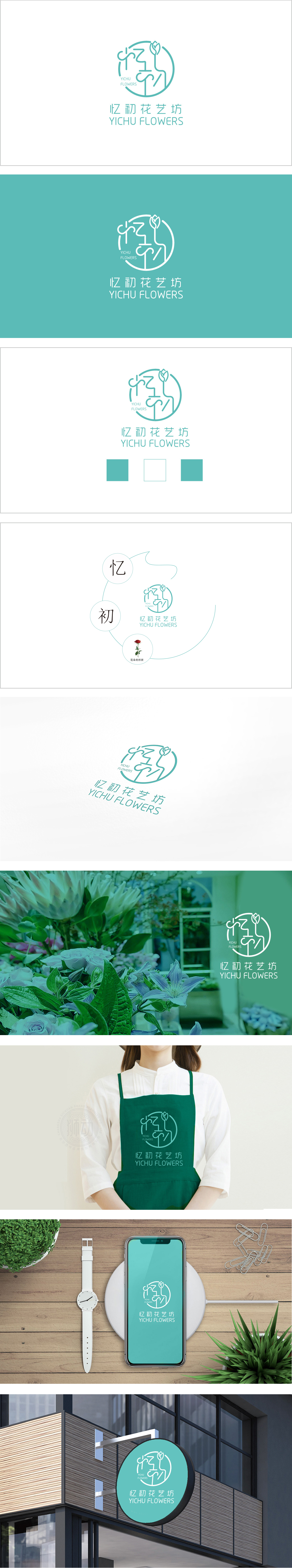
狮动设计采用圆形轮廓作为视觉载体,既象征圆满、和谐的氛围,也暗喻花艺带来的“圆满生活”或“美好回忆”。线条勾勒出女性柔和的侧脸轮廓,传递品牌对“人”的关注——花艺与人的情感联结,以抽象的“花茎+花瓣”造型呈现,象征生命力与自然之美,呼应“花艺”主题;手写笔触的温度感:增强品牌的亲和力与独特性。采用柔和的薄荷绿作为主色调,传递自然、清新、雅致的品牌气质,与“花艺坊”的行业属性高度契合。线条的流畅性和留白处理,营造出简约而不失细腻的东方美感,符合“忆初”所蕴含的温柔、初心的情感内核。
Lion design uses a circular outline as a visual carrier, which not only symbolizes a complete and harmonious atmosphere, but also implies a "complete life" or "good memories" brought by floral art. The lines outline the soft profile of women's side faces and convey the brand's concern for "people"-the emotional connection between floral art and people is presented in the abstract shape of "flower stem+petals", which symbolizes vitality and natural beauty and echoes the theme of "floral art"; The sense of temperature of handwritten strokes: enhancing the affinity and uniqueness of brands. Soft mint green is used as the main color, conveying natural, fresh and elegant brand temperament.


扫码或拨打添加客服微信


