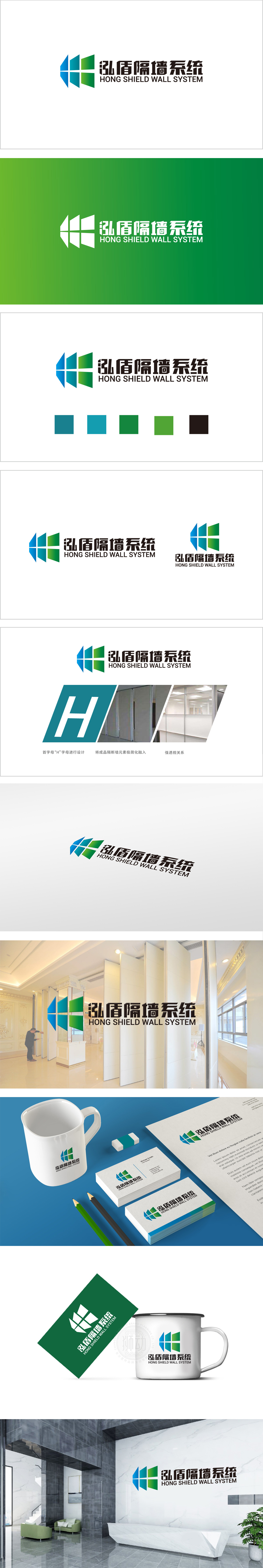
狮动设计以品牌名称“弘盾”首字母“H”为原型,通过对称切割与几何块面重组,形成由蓝色、青色、绿色四方格组成的盾牌状图形(顶部图形)。方格排列严谨有序,既强化了“H”的符号记忆,又暗喻隔墙系统“模块化拼接”的产品特性,主色调采用深浅递进的蓝青色,传递隔墙系统在办公空间中“专业、冷静、高效”的属性,同时蓝色象征“信任”,契合品牌作为“空间解决方案提供者”的可靠形象。以“符号化、极简化、场景化”的设计策略,为弘盾隔墙系统打造了一枚兼具“品牌辨识度”与“行业说服力”的LOGO。
Lion design takes the initial letter "H" of the brand name "Hongdun" as the prototype, and forms a shield-like figure (top figure) composed of blue, cyan and green squares through symmetrical cutting and geometric block reorganization. The grid arrangement is rigorous and orderly, which not only strengthens the symbol memory of "H", but also implies the product characteristics of "modular splicing" of the partition system. The main color adopts blue-cyan with progressive shades, which conveys the attributes of "professionalism, calmness and efficiency" of the partition system in the office space, and blue symbolizes "trust".


扫码或拨打添加客服微信


