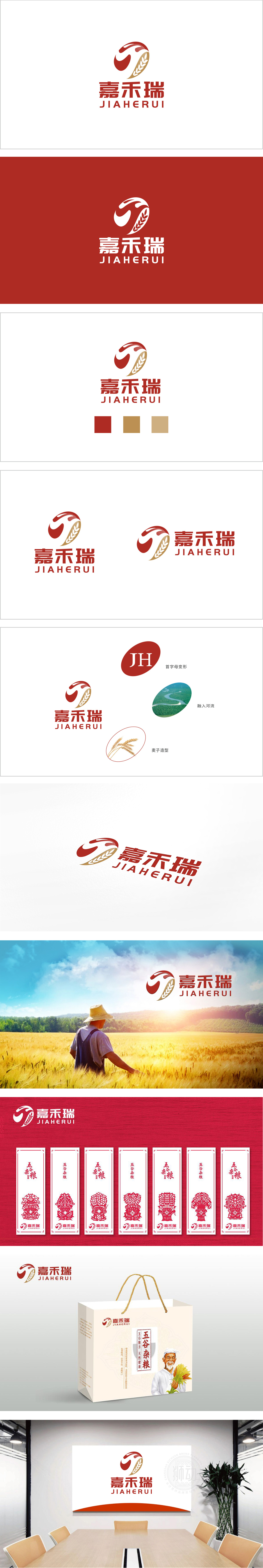
狮动设计采用“JH”字母变形,字体采用流畅的无衬线体,又通过弧线造型传递出亲和与活力。红色抽象曲线:形似流动的“河流”或“纽带”,与,既呼应了自然生态主题,又象征品牌与土地、水源的紧密联系;金色麦穗造型:直接点明“嘉禾”的农业属性,金色则传递丰收、优质的价值感;整体通过红色(热情、丰收)+ 金色(尊贵、成熟)+ 绿色(自然、生态)的色彩搭配,精准触达农业品牌的核心情感——既体现土地的生命力,又传递产品的高品质;河流与麦穗的意象组合,唤起“水土滋养万物”的自然联想,强化“源于自然、臻于品质”的品牌主张。
Lion design uses "JH" letter deformation, the font uses smooth sans serif, and conveys affinity and vitality through arc modeling. Red abstract curve: looks like a flowing "river" or "link", which not only echoes the theme of natural ecology, but also symbolizes the close relationship between brand and land and water; Golden wheat ear modeling: directly point out the agricultural attribute of "Jiahe", and gold conveys the sense of value of bumper harvest and high quality; On the whole, through the color matching of red (enthusiasm and harvest)+gold (dignity and maturity)+green (nature and ecology), the core emotions of agricultural brands are accurately touched-not only reflecting the vitality of the land, but also conveying the high quality of products.


扫码或拨打添加客服微信


