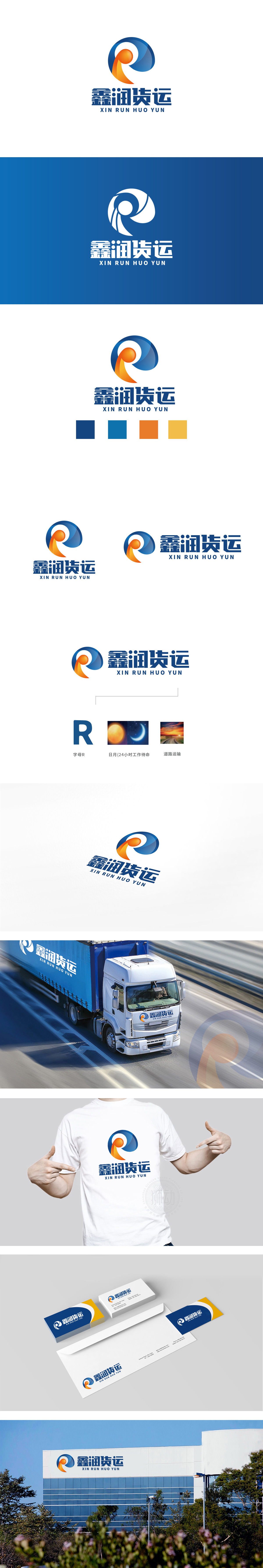
狮动设计以“圆环+流线+圆点”构成,蓝色闭环设计既象征货运业务的“循环运输”属性,又通过渐变蓝的深浅层次,增强空间感,隐喻企业覆盖范围的广度与可靠性。流线型切割:形成动态的“包裹运输”意象——橙色线条从圆环内侧向外舒展,末端微微上扬,既像货运车辆的行驶轨迹,又似“纽带”连接起点与终点,传递“高效直达”的业务特质;通过抽象符号实现“通感联想”,既提升标志的现代感,图形既像字母“R”,又似环形跑道,暗合“畅通无阻”的业务愿景,传递“专业可靠+高效直达”的品牌形象。
Lion design is composed of "circle+streamline+dot". The blue closed-loop design not only symbolizes the "circular transportation" attribute of freight business, but also enhances the sense of space by gradually changing the depth of blue, which symbolizes the breadth and reliability of enterprise coverage. Streamlined cutting: form a dynamic image of "parcel transportation"-orange lines stretch from the inside to the outside of the ring, and the end rises slightly.


扫码或拨打添加客服微信


