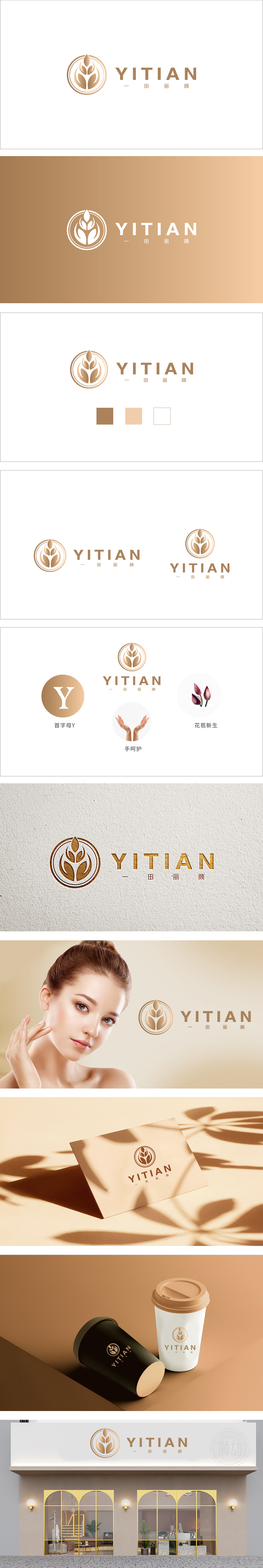
狮动设计采用同心圆+抽象植物形态为核心,外层金色圆环象征专业与品质的闭环,内部由多片向上舒展的“叶片/麦芒”构成对称图形:叶片的层叠结构既似初生的麦穗(传递自然、原生态的品牌联想),又似含苞待放的花瓣(关联“丽颜”的美肤属性),线条流畅且富有生长感,隐喻“自然孕育美丽”的核心价值。线条流畅且富有生长感,隐喻“自然孕育美丽”的核心价值。双手掌心向上、指尖微拢,形成“捧护”的姿态,手部线条柔和、肤色自然,传递“温柔呵护”“专业护理”的服务承诺。“以自然为源,以呵护为道,以新生为果”,通过视觉语言让消费者感知到“温和、专业、值得信赖”的品牌形象。。
Lion design takes concentric circles+abstract plant forms as the core, the outer golden circle symbolizes the closed loop of professionalism and quality, and the inner part is composed of a number of upward stretching "leaves/wheat awns" to form a symmetrical figure: the laminated structure of leaves is like a newborn ear of wheat (conveying the brand association of nature and original ecology), and it is like a budding petal (associated with the beauty attribute of beauty), with smooth lines and a sense of growth, which means that "nature breeds beauty" The lines are smooth and full of growth, which is a metaphor for the core value of "nature breeds beauty". The palms of both hands are upward and the fingertips are slightly close together, forming a gesture of "holding and protecting". The lines of the hands are soft and the skin color is natura.


扫码或拨打添加客服微信


