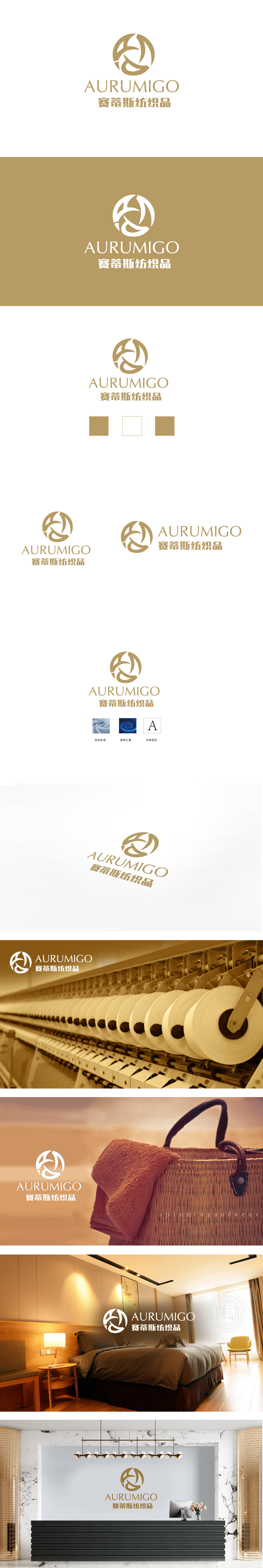
狮动设计采用金色环形轮廓为基底,内嵌抽象化的“丝线缠绕”意象——通过三条相互交织、首尾衔接的曲线构成动态闭环。曲线的柔软质感与交织形态,直观呼应纺织品的“纤维”“编织”本质,线条的韵律感暗喻面料的垂坠与流动特性;环形轮廓则强化“圆满”“高端”的品牌定位,同时曲线交叉形成的负空间(白色区域)既增加图形透气感,又暗含“连接”“循环”的品牌理念(如供应链整合、工艺传承)。整体而言,图形的“柔”与字体的“稳”、金色的“贵”与负空间的“空”形成巧妙平衡,精准定位“兼具工艺传承与国际视野的纺织品服务商”形象。
Lion design is based on the golden circular outline and embedded with the abstract image of "silk thread winding"-a dynamic closed loop is formed by three intertwined and end-to-end curves. The soft texture and interweaving form of curves directly echo the "fiber" and "weaving" essence of textiles, and the rhythm of lines is a metaphor for the sagging and flowing characteristics of fabrics; The circular outline strengthens the "perfect" and "high-end" brand positioning, and the negative space (white area) formed by the intersection of curves not only increases the graphic breathability, but also implies the brand concept of "connection".


扫码或拨打添加客服微信


