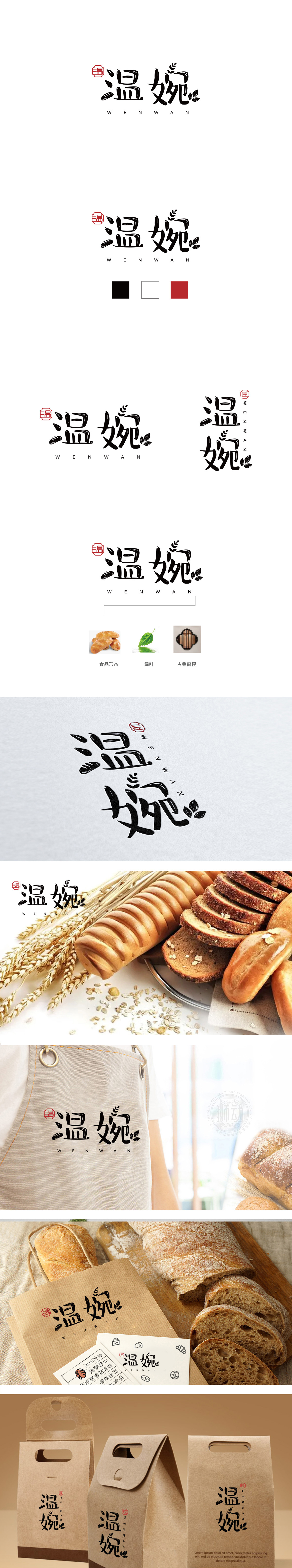
狮动设计以传统中式窗棂的“回纹”与“方格”结构,线条方正对称,兼具镂空通透感,又传递出雅致、内敛的东方美学,暗喻品牌对传统工艺的传承。“温婉”二字采用手写毛笔字体,笔画粗细变化自然,如“温”字左侧三点水以墨滴晕染效果呈现,右侧“昷”部结构舒展;“婉”字右侧“宛”部收笔,轻盈,搭配顶部抽象化的枝叶图形,柔化整体线条,将“温婉”的柔美气质具象化。字体整体保留书法的气韵流动,避免过于工整的刻板感,体现中式美学中“刚柔并济”的平衡,与烘焙产品外酥内软的口感形成微妙呼应。既体现品牌如中式糕点般的细腻口感(味觉温婉),又传递服务中的温和、亲切态度(情感温婉)。
Lion design adopts the "palindrome" and "grid" structure of traditional Chinese window lattice, with symmetrical lines, hollow and transparent feeling, and conveys elegant and restrained oriental aesthetics, which is a metaphor for the brand's inheritance of traditional crafts. The word "Wen Wan" is written with a brush, and the stroke thickness changes naturally. For example, the three dots on the left side of the word "Wen" are presented with ink drop blooming effect, and the structure of the "card" on the right side is stretched; The "Wan" part on the right side of the word "Wan" has a light pen collection, and with the abstract branches and leaves at the top, it softens the whole line and visualizes the feminine temperament of "Wen Wan".


扫码或拨打添加客服微信


