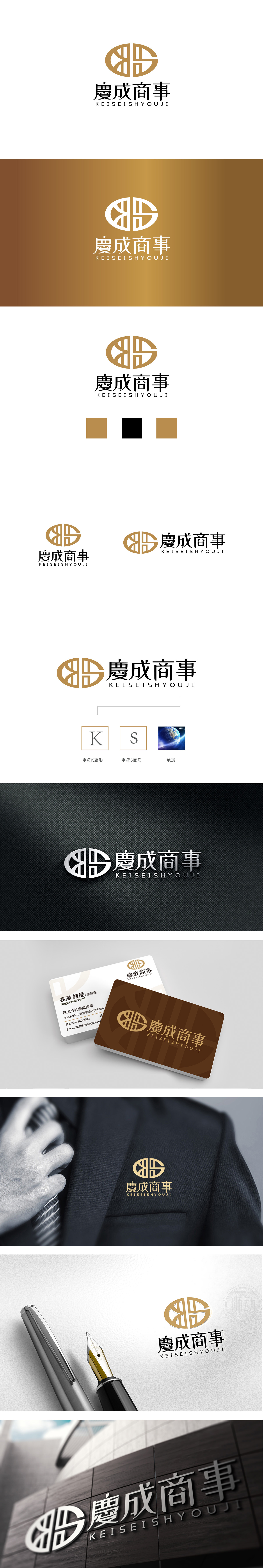
狮动设计以两个对称的“G”形,在圆形轮廓内交织,形成类似传统“回纹”的闭环结构。回纹象征“生生不息、吉祥永续”,传递出企业对“长期主义”“稳健经营”的价值主张,尤其契合“商事”(商业服务)领域对可靠性、持续性的客户需求。圆形轮廓弱化了棱角,既体现包容性,又隐喻“全球化”或“闭环服务”,与“商事”的综合性定位形成呼应。“慶成商事”的标志设计通过传统符号现代转译、色彩心理学应用、信息层级优化三大策略,将“商事”服务的“可靠性、专业性、文化适配性”转化为可感知的视觉语言。
Lion design takes two symmetrical "G" shapes and interweaves them in a circular outline to form a closed-loop structure similar to the traditional "palindrome". The palindrome symbolizes "endless life, good fortune and permanence", which conveys the value proposition of "long-term" and "steady management" of enterprises, especially in line with the customer demand for reliability and sustainability in the field of "commerce" (commercial services). The circular outline weakens the edges and corners, which not only embodies inclusiveness, but also symbolizes "globalization" or "closed-loop service", echoing the comprehensive positioning of "commerce".


扫码或拨打添加客服微信


