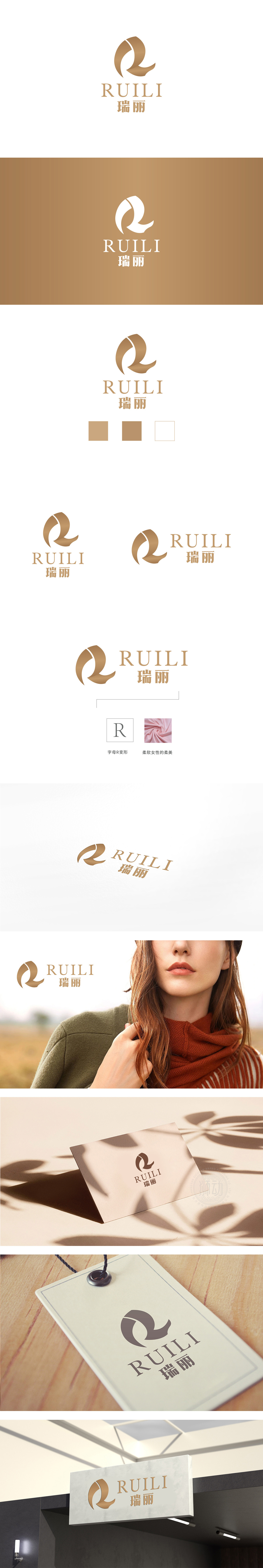
狮动设计采用金色曲线构成的抽象“R”为主体,整体呈现出强烈的流动性与韵律感:闭合圆弧与飘逸“飘带”形成视觉张力,既保留了字母“R”的识别性,又通过曲线的转折与留白增强了图形的呼吸感,避免封闭感。线条的粗细变化,模拟了毛笔笔触的抑扬顿挫,暗藏东方美学中的“气韵生动”,整体图形无尖锐棱角,圆角与曲线的运用传递亲和力,符合大众审美中的“柔和美”,降低品牌距离感。既有东方美学的含蓄(曲线、笔触),又有现代设计的精准(结构、比例);既有行业属性的暗示(时尚、柔美),又有普世审美的共鸣(优雅、质感)。
Lion design takes the abstract "R" composed of * * golden curve as the main body, and the whole design presents a strong sense of fluidity and rhythm: the closed arc and the elegant "ribbon" form visual tension, which not only retains the recognition of the letter "R", but also enhances the breathing sense of the figure through the turning and blank space of the curve to avoid the sense of closure. The change of line thickness simulates the cadence of brush strokes, and hides the "vivid charm" in oriental aesthetics. The overall figure has no sharp edges and corners, and the use of rounded corners and curves conveys affinity.


扫码或拨打添加客服微信


