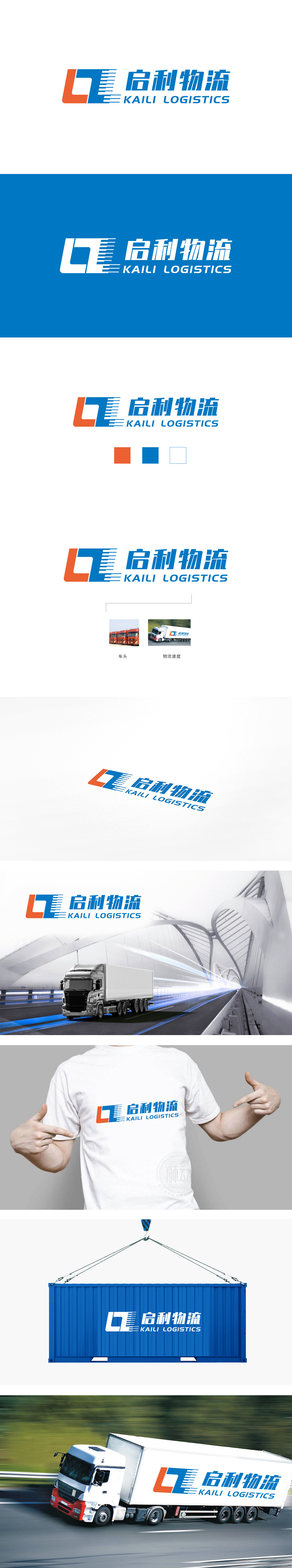
狮动设计以橙色与蓝色组成的抽象“L”为核心符号,橙色部分呈方形结构,象征物流行业的稳重与可靠性;蓝色部分则通过渐变线条与“速度线”元素,形成向前推进的动态感,直观传递物流运输的高效与时效性,线条的排列既像道路延伸,巧妙呼应“物流”的核心业务。中文“启利物流”:采用加粗的无衬线字体,笔画硬朗,结构紧凑,与图形符号的力量感相统一,“启”字有“开启、高效”之意,“利”字暗示“便捷、利益”,名称与行业属性高度契合。既用最简洁的视觉语言让受众快速联想到“物流”行业,又通过细节设计(如速度线、色彩象征)传递企业“高效、可靠、现代”的核心价值,符合物流企业对品牌形象“专业度”与“传播力”的双重需求。
Lion design takes the abstract "L" composed of orange and blue as the core symbol, and the orange part is square structure, which symbolizes the stability and reliability of the logistics industry; The blue part forms a dynamic sense of moving forward through the gradual change of lines and "speed line" elements, which intuitively conveys the efficiency and timeliness of logistics transportation. The arrangement of lines is not only like the extension of roads, but also cleverly echoes the core business of "logistics".Chinese "Qili Logistics": bold sans serif font is adopted, with tough strokes and compact structure, which is consistent with the power sense of graphic symbols.


扫码或拨打添加客服微信


