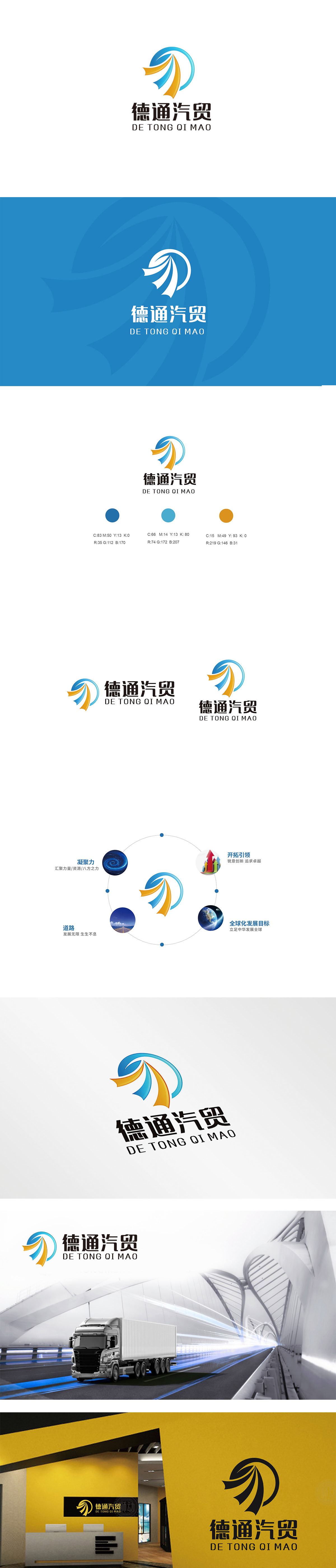
狮动设计采用蓝白渐变圆环,是整个设计的“定海神针”:圆形象征圆满、可靠,直接呼应“德”字的“诚信品质”——汽贸行业最核心的信任背书,全藏在这个圆里;蓝白渐变的色调,像汽车行业的“科技基因”:蓝色代表专业、科技、信任,像在说:“我们的汽贸服务,既专业又靠谱。”再看圆环内的蓝橙飘带/翅膀,简直是“动态的品牌语言”:向上展开的形状,像汽车加速时的气流,又像“翅膀”,直接关联汽贸行业的速度、动力、自由。传递“我们是一家有专业 有活力、懂速度的汽贸品牌。”
Lion design adopts a blue and white gradient ring, which is the "anchor needle" of the whole design: the circle symbolizes perfection and reliability, and directly echoes the "integrity quality" of the word "Germany"-the core trust endorsement of the automobile trade industry, all hidden in this circle; The gradation of blue and white is like the "technology gene" of the automobile industry: blue represents professionalism, technology and trust, as if to say, "Our automobile trade service is both professional and reliable." Looking at the blue orange ribbon/wings in the ring, it is simply a "dynamic brand language": the upward shape, like the airflow when the car accelerates, is like a "wing".


扫码或拨打添加客服微信


