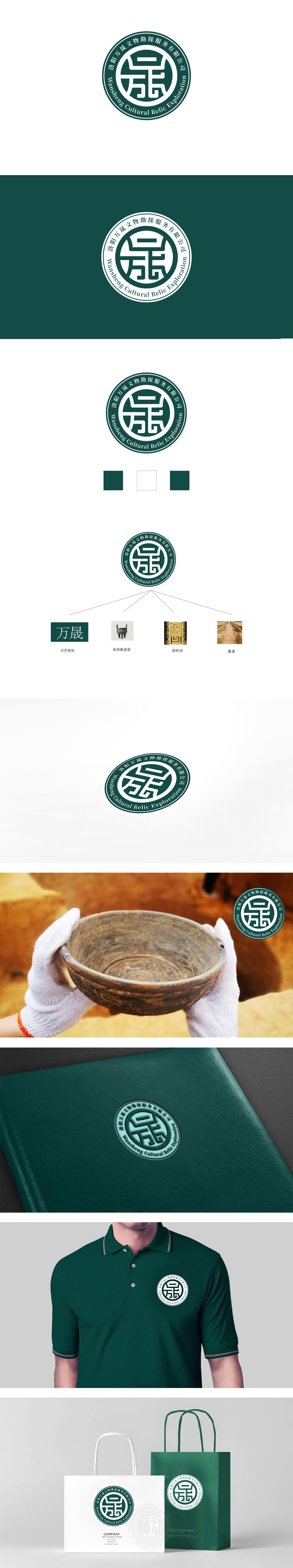
狮动设计采用同心圆结构,外层环形包围核心图形,既符合传统印章的形制(象征权威、信任与专业认证),又通过环形线条的闭合感传递“全面勘探、严谨服务”的行业特性,视觉上稳定且具有凝聚力。以深绿色为主色调,绿色象征“探索、自然、可持续”,同时沉稳的色调强化了历史厚重感与专业性,“方”字的框架结构(外框与横纵线条)象征“方法、规范、边界”,呼应文物勘探中“精准定位、科学勘探”的专业要求,同时“方”也可联想为“方形探坑”“考古坐标”等行业元素。整体设计借鉴传统印章的“篆印”形态,印章在中国文化中代表“权威、认证、承诺”,与文物勘探行业“为文物保护提供专业鉴定与勘探报告”的核心职能高度契合,强化了品牌的公信力。
Lion design adopts concentric structure, and the outer ring surrounds the core graphics, which not only conforms to the shape of traditional seals (symbolizing authority, trust and professional certification), but also conveys the industrial characteristics of "comprehensive exploration and rigorous service" through the closed feeling of circular lines, which is visually stable and cohesive. The main color is dark green, which symbolizes "exploration, nature and sustainability". At the same time, the calm tone strengthens the historical sense and professionalism.The frame structure of the word "square" (outer frame and horizontal and vertical lines) symbolizes "method, specification and boundary", echoing the professional requirements of "accurate positioning .


扫码或拨打添加客服微信


